Crafting Personalized Color Themes: Designing Dark, Light, or Custom Palettes with CSS and Javascript
Crafting personalized color themes switcher - unveiling dark, light, or custom palettes with the power of CSS variables and Javascript.
In today’s web, it’s essential that visual appeal of a website plays a vital role in attracting and engaging usets. A well-designed website not only captivates attention but also provides a seamless browsing experience. One effective technique to enhance user experience of your website is to incorporate multiple color themes, including dark and light and other variants.
This article will provide you step-by-step guidence to implement color theme using CSS variables and JavaScript.
Creating Dynamic Color Themes
To achieve dynamic color themes on your website, we’ll use CSS variables for colors and JavaScript for toggling and storing user preferences. Let’s break down the process into manageable steps:
Step 1: Defining CSS Variables
We’ll begin by defining the CSS variables for each color theme. Below are examples of color variables for default (light), dark, solarized, and blue themes:
CSS Class for Default(light) Theme
.light,
body[color-theme="light"] {
  --bg: #f0f8ff;
  --bg-light: rgba(255, 255, 255, 0.8);
  --clr-text: #182227;
  --clr-text-light: #182227bb;
  --clr-element: #34506e;
  --clr-element-hover: #34506ebb;
  --clr-shadow: rgba(0, 0, 0, 0.15);
}
CSS Class for Dark Theme
.dark,
body[color-theme="dark"] {
  --bg: #182227;
  --bg-light: rgba(255, 255, 255, 0.15);
  --clr-text: #fce8ec;
  --clr-text-light: #fce8ecbb;
  --clr-element: #ffabc2;
  --clr-element-hover: #ffabc2bb;
  --clr-shadow: rgba(0, 0, 0, 0.2);
}
CSS Class for Solarized Theme
.solarized,
body[color-theme="solarized"] {
  --bg: #002b36;
  --bg-light: rgba(255, 255, 255, 0.15);
  --clr-text: #fdf6e3;
  --clr-text-light: #fdf6e3bb;
  --clr-element: #93a1a1;
  --clr-element-hover: #93a1a1bb;
  --clr-shadow: rgba(0, 0, 0, 0.2);
}
CSS Class for Blue Theme
.blue,
body[color-theme="blue"] {
  --bg: #0b3393;
  --bg-light: #5f8eff73;
  --clr-text: #bed7ff;
  --clr-text-light: #bed7ffdd;
  --clr-element: #7ebcff;
  --clr-element-hover: #7ebcffbb;
  --clr-shadow: rgba(0, 0, 0, 0.15);
}
You’re free to customize the colors of your choice in above code snippet.
Step 2: Global CSS Variables & transition
Set up global CSS variables that apply to all themes:
Global CSS Variables
:root {
  --pf: "Source Sans Pro", sans-serif;
  --transition: all 0.5s;
}
Then apply the transition to all elements. Because of this transition, it will give user smooth effects while changing the themes.
Apply a transition(purpose: smooth switching) to all the elements
* {
  transition: var(--transition);
}
Step 3: Applying the Color Variables
CSS Stylesheet
body {
  background: var(--bg);
  font-family: var(--pf);
  transition: var(--transition);
  border-bottom: 10px solid var(--clr-element);
}
.title {
  font-family: var(--pf);
  color: var(--clr-text);
  font-weight: 800;
  font-size: 2.5rem;
}
.box {
  padding: 2rem;
  border: 2px solid var(--clr-element);
  border-radius: 5px;
  color: var(--clr-text);
  display: flex;
  align-items: center;
  justify-content: center;
}
.card {
  background: var(--bg-light);
  box-shadow: 0 2px 10px var(--clr-shadow);
  padding: 1rem;
  border-radius: 5px;
  transition: all 0.2s;
}
/* your css */
Step 4: HTML Structure
Incorporate the HTML structure that enables theme switching:
HTML Structure
<body id="body" class="light">
<!-- Your website content -->
</body>
<!-- -- Or -- -->
<body color-theme="dark">
<!-- Your website content -->
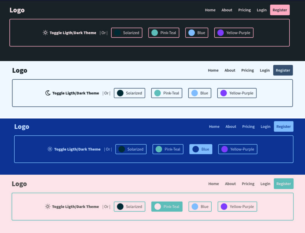
</body>[# see the demo for more color themes]
Replace the class attribute of the <body> tag to activate the desired theme. This method can be enhanced by using custom data attributes if your website has other classes.
The body tag contains only one theme class else color switch will not work using this method. If your body contains multiple classes then you can use use data attributes to switch between themes. Ex and change the attribute instead of class. We will add both the methods in this tutorial.
HTML Markup for Theme Switcher, or Theme Selector.
<div class="box">
<!-- // Toggle switcher(dark/light) -->
<span dd-toggle="theme" class="df">
<div id="toggle_theme" class="dd-theme__switcher">
<span class="dd-theme__switcher-btn">
<svg
xmlns="http://www.w3.org/2000/svg"
class="dd-icon icon-tabler icon-tabler-sun"
width="24"
height="24"
viewBox="0 0 24 24"
stroke-width="2"
fill="none"
stroke-linecap="round"
stroke-linejoin="round"
>
<path stroke="none" d="M0 0h24v24H0z" />
<circle cx="12" cy="12" r="4" />
<path
d="M3 12h1M12 3v1M20 12h1M12 20v1M5.6 5.6l.7 .7M18.4 5.6l-.7 .7M17.7 17.7l.7 .7M6.3 17.7l-.7 .7"
/>
</svg>
<svg
xmlns="http://www.w3.org/2000/svg"
class="dd-icon icon-tabler icon-tabler-moon"
width="24"
height="24"
viewBox="0 0 24 24"
stroke-width="2"
fill="none"
stroke-linecap="round"
stroke-linejoin="round"
>
<path stroke="none" d="M0 0h24v24H0z" />
<path d="M16.2 4a9.03 9.03 0 1 0 3.9 12a6.5 6.5 0 1 1 -3.9 -12" />
</svg>
</span>
</div>
<label class="box-lbl" for="toggle_theme"
><strong>Toggle Ligth/Dark Theme</strong></label
> </span
> | Or |
<!-- Other Available Themes -->
<label dd-theme="solarized" class="theme--label">
<span></span>Solarized color theme </label
>
<label dd-theme="pt" class="theme--label">
<span></span>Pink-Teal color theme </label
>
<label dd-theme="blue" class="theme--label">
<span></span>Blue color theme </label
>
<label dd-theme="yp" class="theme--label">
<span></span>Yellow-Purple color theme </label
>
</div>CSS for Theme Switcher/Selector
.dd-icon {
  stroke: var(--clr-text);
}
.dd-theme__switcher {
  position: relative;
  overflow: hidden;
  display: inline-block;
  width: 25px;
  height: 25px;
  cursor: pointer;
}
.dd-theme__switcher .dd-theme__switcher-btn {
  position: absolute;
  display: flex;
  flex-direction: column;
  transition: var(--transition);
  top: 0;
}
body.light .dd-theme__switcher .dd-theme__switcher-btn {
  top: -24px;
}
.theme--label {
  display: flex;
  align-items: center;
  border: 2px solid var(--clr-element);
  padding: 5px 10px;
  border-radius: 4px;
  margin: 0 10px;
  cursor: pointer;
}
.theme--label span {
  position: relative;
  display: inline-block;
  width: 25px;
  height: 25px;
  border-radius: 25px;
  margin-right: 10px;
}
.theme--label[dd-theme="solarized"] span {
  background: #002b36;
}
.theme--label[dd-theme="pt"] span {
  background: #5cbdb9;
}
.theme--label[dd-theme="blue"] span {
  background: #7ebcff;
}
.theme--label[dd-theme="yp"] span {
  background: #7d3cff;
}
.theme--label[dd-theme].active {
  color: var(--bg);
  background: var(--clr-element);
}
.theme--label[dd-theme].active span {
  background: var(--bg);
}
Step 5: T heme Switcher Using JavaScript
The following script allows users to toggle between light and dark themes, with their preferences stored in localStorage:
In javascript, we will do the following tasks to activate & store the selected theme.
Javascript to toggle between light and dark theme
// Set the theme from localStorage(if exist) || or set default light
let theme = window.localStorage.getItem("theme") || "light";
// Activate the current theme (using class)
body.classList = theme;
// Available Themes
let available_themes = document.querySelectorAll("[dd-theme]");
/** Light / Dark theme Toggle */ // Toggle Dark / Light theme
let _toggler = document.querySelector("[dd-toggle]");
_toggler.addEventListener("click", toggleTheme);
// Function: toggle theme(light & dark)
function toggleTheme() {
  // Toggle light / dark theme
  theme == "light" ? (theme = "dark") : (theme = "light");
  // Apply class to body
  body.classList = theme;
  // Store theme var to localStorage
  window.localStorage.setItem("theme", theme);
}
If your project contains more then 2 themes then you can activate/deactivate them using below code snippet.
Javascript to toggle between multiple custom themes
/** Switch Theme **/
// Set the theme from localStorage(if exist) || or set default light
let theme = window.localStorage.getItem("theme") || "light";
// Activate the current theme
body.classList = theme;
// Available Themes
let available_themes = document.querySelectorAll("[dd-theme]");
available_themes.forEach((e) => {
  window.localStorage.getItem("theme") == e.getAttribute("dd-theme")
    ? e.classList.add("active")
    : null;
  e.addEventListener("click", switchTheme);
});
function switchTheme() {
  available_themes.forEach((e) => {
    e.classList = "theme--label";
  });
  let theme = this.getAttribute("dd-theme");
  this.classList.add("active");
  body.classList = theme;
  window.localStorage.setItem("theme", theme);
}
If you want to use an attribute to switch the theme instead of body class then replace the below snippet
body.classList = theme;with
body.setAttribut("color-theme", theme);I also recommend these color palette generators: Coolors, Muzli Colors, and Color Space to generate the color codes for your themes.
Thanks for reading! Feel free to share the article with others.
Thanks!