Unveiling Card Details Using Perspective CSS properties
Unveiling card content on hover effects using Perspective CSS properties.
In this article, we will craft the creative card design and reveal card details on card hover using CSS perspective properties.
Let’s dive into the step-by-step guide on how to create these stunning animations.
HTML Structure
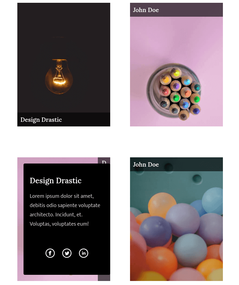
<div class="dd-card left inside">
  <div class="front" dd-bg="images/5.jpg">
    <label class="front-caption caption-l">John Doe</label>
  </div>
  <div class="back">
    <h2 class="dd-title">John Doe</h2>
    <p class="dd-text">
      Lorem ipsum dolor sit amet, consectetur adipisicing elit. Eius sequi natus
      doloribus voluptatem debitis odio sapiente voluptate architecto. Incidunt,
      et. Voluptas, voluptates eum!
    </p>
    <ul class="dd-card__link">
      <li>
        <a href="#"> <img src="svg/facebook.svg" /> </a>
      </li>
      <li>
        <a href="#"> <img src="svg/twitter.svg" /> </a>
      </li>
      <li>
        <a href="#"> <img src="svg/linkedin.svg" /> </a>
      </li>
    </ul>
  </div>
</div>
To switch up the card effect, just modify the main class name in tandem with the ".dd-card" class.
Here’s a list of classes for different effects:
— left(inside)
<div class="dd-card left inside"></div>— left(outside)
<div class="dd-card left outside"></div>– Right(inside)
<div class="dd-card right inside"></div>– Right(outside)
<div class="dd-card right outside"></div>– Top(inside)
<div class="dd-card top inside"></div>– Top(outside)
<div class="dd-card top outside"></div>– Bottom(inside)
<div class="dd-card bottom inside"></div>– Bottom(outside)
<div class="dd-card bottom outside"></div>– Info(left)
<div class="dd-card info in-top"></div>– Info(right)
<div class="dd-card info in-right"></div>– Info(top)
<div class="dd-card info in-top"></div>– Info(bottom)
<div class="dd-card info in-bottom"></div>CSS Styles
/*   Crafted and Designed By DesignDrastic   Author: DesignDrastic   License URL: http://designdrastic.com/license */
:root {
  --ff-title: "Lora", serif;
  --ff-text: "Mukta", sans-serif;
}
.dd-title {
  font-family: var(--ff-title);
  color: #fff;
  font-weight: 600;
}
.dd-text {
  font-family: var(--ff-text);
  font-size: 1.1rem;
  color: #ffffffcc;
} /* Card */
.dd-card {
  position: relative;
  margin: 0 auto;
  margin-bottom: 100px;
  width: 300px;
  height: 400px;
}
.dd-card .front,
.dd-card .back {
  position: relative;
  transition: all 0.5s;
  width: 100%;
  height: 100%;
}
.dd-card .front {
  transform-origin: bottom;
  transform: perspective(600px) rotateX(0deg);
  top: 0;
  left: 0;
  background-size: cover !important;
  cursor: pointer;
}
.front-caption {
  position: absolute;
  left: 0;
  width: calc(100% - 20px);
  background-color: rgba(0, 0, 0, 0.6);
  padding: 10px;
  color: #fff;
  font-weight: 500;
  font-family: var(--ff-title);
  font-size: 1.2rem;
  font-weight: 600;
}
.front-caption.caption-t {
  left: 0;
  top: 0;
}
.front-caption.caption-b {
  left: 0;
  bottom: 0;
}
.front-caption.caption-l {
  left: 0;
  height: calc(100% - 20px);
  width: auto;
  writing-mode: vertical-rl;
  text-orientation: upright;
}
.front-caption.caption-r {
  left: auto;
  right: 0;
  height: calc(100% - 20px);
  width: auto;
  writing-mode: vertical-rl;
  text-orientation: upright;
}
.dd-card .back {
  position: absolute;
  top: 0;
  left: 0;
  padding: 20px;
  width: 100%;
  height: 100%;
  box-sizing: border-box;
  background-color: #000;
  color: #fff;
  z-index: 9;
}
.dd-card__link {
  position: absolute;
  bottom: 20px;
  list-style: none;
  padding: 0;
  left: 0;
  width: 100%;
  text-align: center;
}
.dd-card__link li {
  display: inline-block;
  margin: 10px;
}
.dd-card__link li a img {
  width: 30px;
  transition: all 0.5s;
}
.dd-card__link li a:hover img {
  transform: scale(1.2);
} /* Bottom */
.dd-card.bottom .back {
  top: 100%;
  transform: perspective(600px) rotateX(-90deg);
  transform-origin: top;
}
.dd-card.bottom.inside .back {
  top: 0;
}
.dd-card.bottom:hover .back {
  transform: perspective(0) rotateX(0deg);
} /* Top */
.dd-card.top .front {
  transform-origin: top;
}
.dd-card.top .back {
  top: -100%;
  transform: perspective(600px) rotateX(90deg);
  transform-origin: bottom;
}
.dd-card.top.inside .back {
  top: 0;
}
.dd-card.top:hover .back {
  transform: perspective(0) rotateX(0deg);
} /* Left */
.dd-card.left .front {
  transform-origin: left;
}
.dd-card.left .back {
  transform-origin: right;
  left: -100%;
  transform: perspective(600px) rotateY(-90deg);
}
.dd-card.left.inside .back {
  left: 0;
}
.dd-card.left:hover .back {
  transform-origin: right;
  transform: perspective(0) rotateY(0deg);
} /* Right */
.dd-card.right .front {
  transform-origin: right;
}
.dd-card.right .back {
  transform-origin: left;
  left: 100%;
  transform: perspective(600px) rotateY(90deg);
  z-index: 9;
}
.dd-card.right.inside .back {
  left: 0;
}
.dd-card.right:hover .back {
  transform-origin: left;
  transform: perspective(0) rotateY(0deg);
} /* Info */
.dd-card.info {
  overflow: hidden;
}
.dd-card.info .back {
  height: auto;
  border-radius: 4px;
} /* Left */
.dd-card.info.in-left .back {
  top: 20px;
  bottom: 20px;
  left: -100%;
  width: calc(100% - 20px);
  transform: scaleY(0.6);
}
.dd-card.info.in-left:hover .back {
  left: 0;
  transform: scaleY(1);
} /* Right */
.dd-card.info.in-right .back {
  right: -100%;
  top: 20px;
  left: inherit;
  bottom: 20px;
  width: calc(100% - 20px);
  transform: scaleY(0.6);
}
.dd-card.info.in-right:hover .back {
  right: 0;
  transform: scaleY(1);
} /* Top */
.dd-card.info.in-top .back {
  top: -100%;
  left: 20px;
  right: 20px;
  height: calc(100% - 40px);
  width: calc(100% - 40px);
  transform: scaleX(1.2);
}
.dd-card.info.in-top:hover .back {
  top: 0;
  transform: scaleX(1);
} /* Bottom */
.dd-card.info.in-bottom .back {
  bottom: -100%;
  top: inherit;
  left: 20px;
  right: 20px;
  height: calc(100% - 40px);
  width: calc(100% - 40px);
  transform: scaleX(1.2);
}
.dd-card.info.in-bottom:hover .back {
  bottom: 0;
  transform: scaleX(1);
}
I hope you find this snippet useful.
Thanks for reading.