Text backgorund hover effects
Captivating text stroke and background animation hover effects using CSS.
In this tutorial, we’ll guide you through the process of creating a captivating Text Stroke effect using CSS and applying a beautiful background animation on hover. Let’s dive into the details step by step.
Creating the HTML Structure
HTML Structure
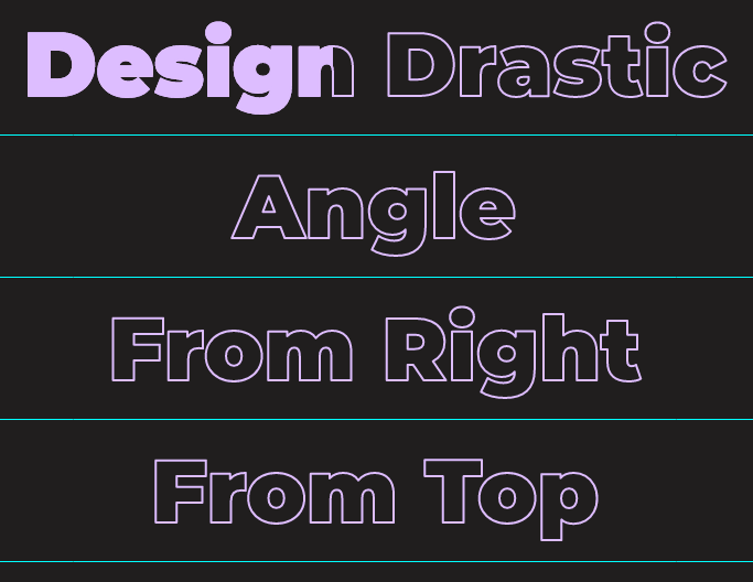
<h2 class="title e1 left">Design Drastic</h2>
<h2 class="title e1 left angle">Angle</h2>
<h2 class="title e1 right">From Right</h2>
<h2 class="title e2 top">From Top</h2>
<h2 class="title e2 bottom">From Bottom</h2>
<h2 class="title e3">From Center</h2>
<h2 class="title e4">Design Drastic</h2>
<!-- Direction aware hover effect -->
<h2 class="title dir" dd-dir>Directional</h2>
<h2 class="title e5">Multicolor</h2>
<h2 class="title e6">Background Image</h2>
Now, let’s style the title elements and apply the Text Stroke effect using CSS: ###CSS
.title {
  font-family: "Montserrat";
  font-weight: 900;
  font-size: 6rem;
  text-align: center;
  margin: 15px;
  display: inline-block;
  -webkit-text-stroke-width: 2px;
  -webkit-text-stroke-color: #ddbdff;
  -webkit-text-fill-color: transparent;
  background-repeat: no-repeat;
  background-clip: text;
  -webkit-background-clip: text;
  color: transparent;
}
In above CSS snippet/class, we’ve created the text-stroke and make background transparent and apply the background-clip property.
Then we will define the effects one by one and apply the background animation. ###Effect 1 CSS
/* Effect 1: */
.title.e1 {
  transition: all 0.5s linear;
  background-image: linear-gradient(#ddbdff, #ddbdff);
  background-size: 0%;
}
/* From left */
.title.e1.left {
  background-position: left;
}
/* From right */
.title.e1.right {
  background-position: right;
}
.title.e1:hover {
  background-size: 100%;
}
/* Angle */
.title.e1.angle {
  transition: all 0.75s;
  background-image: linear-gradient(
    125deg,
    #ddbdff,
    #ddbdff 50%,
    transparent 50%
  );
  background-size: 0% 100%;
}
.title.e1.angle:hover {
  background-size: 215% 100%;
}
Effect 2 CSS
/* Effect 2 */
.title.e2 {
  transition: all 0.5s linear;
  background-image: linear-gradient(#ddbdff, #ddbdff);
  background-size: 100% 0%;
}
/* From top */
.title.e2.top {
  background-position: top;
}
/* From bottom */
.title.e2.bottom {
  background-position: bottom;
}
.title.e2:hover {
  background-size: 100% 100%;
}
Effect 3 CSS
/* Effect 3: From center */
.title.e3 {
  transition: all 0.5s linear;
  background-image: linear-gradient(#ddbdff, #ddbdff);
  background-size: 0%;
  background-position: center;
}
.title.e3:hover {
  background-size: 100%;
}
Effect 4 CSS
/* Effect 4: Gradient */
.title.e4 {
  transition: all 0.75s linear;
  background-image: linear-gradient(90deg, #ddbdff 75%, transparent);
  background-size: 150% 100%;
  background-position-x: 300%;
}
.title.e4:hover {
  background-position-x: 0%;
}
Effect 5 & 6
/* Effect 5 & 6 */
/* 5: mutlicolor 6: bacgkround image */
.title.e5,
.title.e6 {
  transition: all 0.75s linear;
  background-position: left;
  background-size: 0% 100%;
}
.title.e5 {
  background-image: linear-gradient(
    90deg,
    #f77692 0%,
    #f77692 25%,
    PaleGreen 25%,
    PaleGreen 50%,
    #6a5acd 50%,
    #6a5acd 75%,
    #008b8b 75%,
    #008b8b 100%
  );
}
.title.e6 {
  background-image: url("../images/gradient.jpg");
}
.title.e5:hover,
.title.e6:hover {
  background-size: 100% 100%;
}
Direction aware hover effect
/* Direction aware hover */
.title.dir {
  background-image: linear-gradient(#ddbdff, #ddbdff);
  background-size: 0 0;
}
.title.dir[dd-dir="in-top"],
.title.dir[dd-dir="in-bottom"] {
  animation: in-top-bottom 0.75s;
  animation-fill-mode: forwards;
}
.title.dir[dd-dir="in-top"] {
  background-position: top;
}
.title.dir[dd-dir="in-bottom"] {
  background-position: bottom;
}
@keyframes in-top-bottom {
  0% {
    background-size: 100% 0%;
  }
  100% {
    background-size: 100% 100%;
  }
}
.title.dir[dd-dir="in-left"],
.title.dir[dd-dir="in-right"] {
  animation: in-left-right 0.75s;
  animation-fill-mode: forwards;
}
.title.dir[dd-dir="in-left"] {
  background-position: left;
}
.title.dir[dd-dir="in-right"] {
  background-position: right;
}
@keyframes in-left-right {
  0% {
    background-size: 0% 100%;
  }
  100% {
    background-size: 100% 100%;
  }
}
.title.dir[dd-dir="out-top"],
.title.dir[dd-dir="out-bottom"] {
  animation: out-top-bottom 1s;
  animation-fill-mode: forwards;
}
.title.dir[dd-dir="out-top"] {
  background-position: top;
}
.title.dir[dd-dir="out-bottom"] {
  background-position: bottom;
}
@keyframes out-top-bottom {
  0% {
    background-size: 100% 100%;
  }
  100% {
    background-size: 100% 0%;
  }
}
.title.dir[dd-dir="out-left"],
.title.dir[dd-dir="out-right"] {
  animation: out-left-right 1s;
  animation-fill-mode: forwards;
}
.title.dir[dd-dir="out-left"] {
  background-position: left;
}
.title.dir[dd-dir="out-right"] {
  background-position: right;
}
@keyframes out-left-right {
  0% {
    background-size: 100% 100%;
  }
  100% {
    background-size: 0% 100%;
  }
}
Direction Aware Hover Effect For the direction-aware hover effect, we’ll use JavaScript to dynamically adjust the background animation based on mouse movement. Here’s the updated JavaScript code:
Direction aware JS
// Direction aware hover effect
var dir_elems = document.querySelectorAll("[dd-dir]");
dir_elemes.forEach((d) => {
  // Handle mousehandle
  d.addEventListener("mouseenter", mouseEnter);
  // Handle mouseleave
  d.addEventListener("mouseleave", mouseLeave);
});
// Mouse event js
function mouseEvent(e, dir) {
  var el = e.target;
  var w = e.target.clientWidth;
  var h = e.target.clientHeight;
  var x = (e.pageX - el.offsetLeft - w / 2) * (w > h ? h / w : 1);
  var y = (e.pageY - el.offsetTop - h / 2) * (h > w ? w / h : 1);
  const d = { 0: "top", 1: "right", 2: "bottom", 3: "left" };
  var direction =
    Math.round((Math.atan2(y, x) * (180 / Math.PI) + 180) / 90 + 3) % 4;
  el.setAttribute("dd-dir", dir + "-" + d[direction]);
}
function mouseEnter(e) {
  mouseEvent(e, "in");
}
function mouseLeave(e) {
  mouseEvent(e, "out");
}
We hope you enjoy creating stunning visual effects for your projects!