Tempting List Item Designs Using CSS
Stylish ordered, unordered list item style designs using CSS.
HTML lists come with a simple bulleted or circle list. We can design ordered/unordered liet items to make it more attractive and eye-catchy using pure CSS.
To start off, let’s establish a basic HTML structure:
HTML Structure
<ul class="lists">
  <li><a href="#">Web</a></li>
  <li><a href="#">Seo</a></li>
  <li><a href="#">Graphics</a></li>
  <li><a href="#">Designs</a></li>
  <li><a href="#">HTML</a></li>
  <li><a href="#">CSS</a></li>
  <li><a href="#">Js</a></li>
  <li><a href="#">Andoroid</a></li>
  <li><a href="#">Php</a></li>
  <li><a href="#">Java</a></li>
  <li><a href="#">.net</a></li>
  <li><a href="#">C#</a></li>
  <li><a href="#">Python</a></li>
  <li><a href="#">Ruby</a></li>
  <li><a href="#">Perl</a></li>
</ul>
We will use the above common HTML markup for all styles. We will simply change the root(ul) element class/es to modify appearance of these list items.
.lists class is a common class that defines the basic CSS and clears the default properties of the ul element.
We’ll combine different classes(like underline, dash, zig-zag, wave, etc…) with .lists class to create the stunning list designs.
Now, let’s explore the distinct list styles we can achieve:
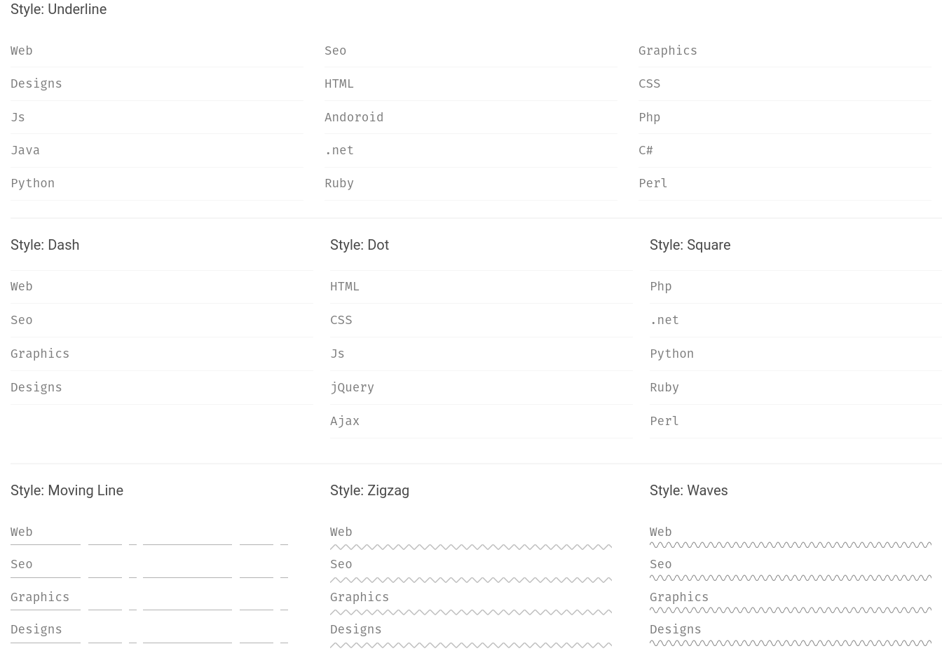
- Underline
<ul class="lists underline"></ul>Marker Designs
• Dash(list marker)
<ul class="lists marker dash"></ul>■ Square(list marker)
<ul class="lists marker square"></ul>SVG Patterns Background Style:
Patterns(svg)
◪ Line-dash
<ul class="lists patterns line-dash"></ul>◪ Zig zag
<ul class="lists patterns zig-zag"></ul>◪ Wave
<ul class="lists patterns wave"></ul>We’ll use a set of carefully crafted CSS styles to achieve these creative list designs. Here’s the CSS code:
CSS Styles
:root {
  --ff: "Fira Mono", sans-serif;
} /* List ul > li > a */
.lists {
  position: relative;
  width: 100%;
  list-style: none;
  padding: 0;
  margin: 0;
  margin-left: -30px;
}
.lists li {
  position: relative;
  margin-left: 30px;
}
.lists li a {
  position: relative;
  display: block;
  font-family: var(--ff);
  font-size: 1.1rem;
  padding: 10px 0;
  width: 100%;
  text-decoration: none;
  color: #7c7c7c;
  transition: all 0.2s;
}
.lists li a:hover {
  color: #3c3c3c;
} /* Design variations */ /* underline */
.lists.bottom-line li {
  float: left;
  width: calc(33.33% - 30px);
}
.lists.bottom-line li::after {
  position: absolute;
  content: "";
  right: 0;
  bottom: -1px;
  width: 0;
  height: 1px;
  background: red;
  transition: all 0.5s;
}
.lists.bottom-line li:hover::after {
  width: 100%;
  left: 0;
  right: auto;
}
.lists.bottom-line li a {
  border-bottom: 1px solid #f5f5f5;
}
.lists.bottom-line li a:hover {
  color: #3c3c3c;
  padding-left: 10px;
} /* Marker */
.lists.marker li {
  width: 100%;
  border-top: 1px solid #f5f5f5;
  border-bottom: 1px solid #f5f5f5;
  margin: -0.5px 0;
  margin-left: 30px;
  transition: 0.25s;
}
.lists.marker li:hover {
  border-color: #dfdfdf;
  background: #f5f9fa;
  z-index: 9;
}
.lists.marker li a:hover {
  padding-left: 20px;
  z-index: 9;
}
.lists.marker li a::after {
  position: absolute;
  content: "";
  top: 50%;
  transform: translateY(-50%);
  left: 5px;
  width: 0;
  height: 0;
  transition: all 0.15s;
} /* dash */
.lists.marker.dash li a::after {
  height: 2px;
  background: red;
  left: 0;
}
.lists.marker.dash li a:hover::after {
  width: 10px;
  left: 0;
} /* dot */
.lists.marker.dot li a::after {
  border-radius: 50%;
  background: plum;
}
.lists.marker.dot li a:hover::after {
  height: 10px;
  width: 10px;
  left: 0;
} /* square */
.lists.marker.square li a::after {
  left: 5px;
  background: palevioletred;
  height: 10px;
}
.lists.marker.square li a:hover::after {
  width: 10px;
  left: 0;
} /* Patterns */
.lists.patterns li::after {
  position: absolute;
  content: "";
  height: 10px;
  width: 100%;
} /* Line dot */
.lists.patterns.line-dash li::after {
  height: 1px;
  top: calc(100% - 5px);
  background: url("../images/lines.svg");
  filter: invert(0.7);
}
.lists.patterns.line-dash li:hover::after {
  animation: animatePattern 3s infinite linear;
} /* Zigzag */
.lists.patterns.zig-zag li::after {
  top: calc(100% - 5px);
  background: url("../images/zig-zag.svg");
  background-size: 15px 15px;
  filter: invert(0.75);
}
.lists.patterns.zig-zag li:hover::after {
  filter: invert(0.5);
  animation: animatePattern 10s infinite linear;
} /* Wave */
.lists.patterns.wave li::after {
  top: calc(100% - 10px);
  background: url("../images/waves.svg");
  background-size: 12px 12px;
  filter: invert(0.75);
}
.lists.patterns.wave li:hover::after {
  filter: invert(0.5);
  animation: animatePattern 12s infinite linear;
}
@keyframes animatePattern {
  0% {
    background-position: 0 0;
  }
  100% {
    background-position: 100% 0;
  }
}
Customize the SVG patterns as needed to achieve the desired visual effect for each pattern. With these styles, you can transform your ordinary HTML lists to eye-catchy design & capture user’s attention.
I hope you guys found this helpful. Happy designing!