CSS Shape and Their Transformation on Hover
Creating CSS Shape & Tranform them on hover using CSS.
In this post, we’re excited to deep dive into the CSS Shapes and explore their transformations triggered by mouseover or hover events, all accomplished using pure CSS and Javascript. We’ll use properties like: clip-path to draft the shape.
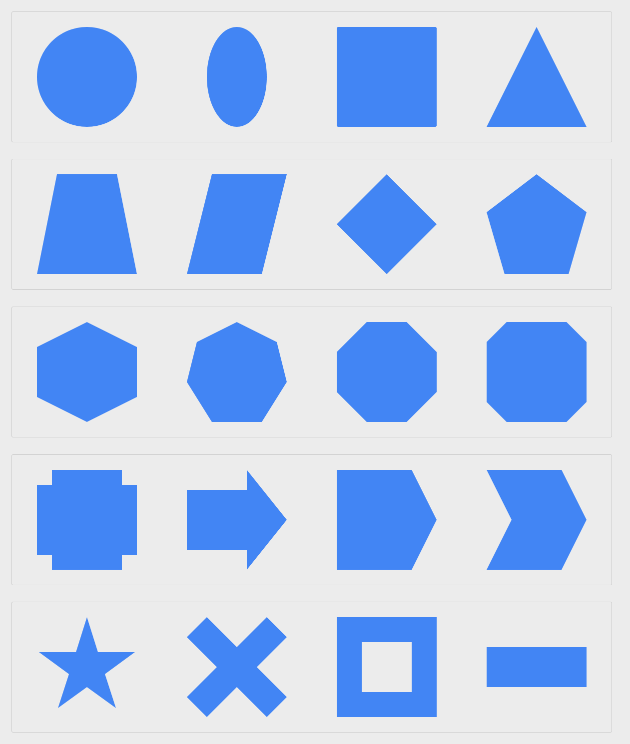
Our demonstration showcases an array of intriguing shape metamorphoses, including transitions like Circle to Square, Square to Triangle, Square to Pentagon, Star to Square, Arrow to Square, and many others.
Please be aware that older web browsers might not fully support the clip-path CSS property utilized in this snippet. You can check the browser compatibility at the following CanIUse link: https://caniuse.com/#search=clip-path
HTML Structure
<div class="shape-row">
  <div class="col-4"><div class="shape circle to-zoom"></div></div>
  <div class="col-4"><div class="shape circle to-ellipse"></div></div>
  <div class="col-4"><div class="shape circle to-square"></div></div>
  <div class="col-4"><div class="shape square to-triangle"></div></div>
</div>
<div class="shape-row">
  <div class="col-4"><div class="shape square to-trapezoid"></div></div>
  <div class="col-4"><div class="shape square to-parallelogram"></div></div>
  <div class="col-4"><div class="shape square to-rhombus"></div></div>
  <div class="col-4"><div class="shape square to-pentagon"></div></div>
</div>
<div class="shape-row">
  <div class="col-4"><div class="shape square to-hexagon"></div></div>
  <div class="col-4"><div class="shape square to-heptagon"></div></div>
  <div class="col-4"><div class="shape square to-octagon"></div></div>
  <div class="col-4"><div class="shape square to-bevel"></div></div>
</div>
<div class="shape-row">
  <div class="col-4"><div class="shape square to-rabbet"></div></div>
  <div class="col-4"><div class="shape arrow-normal to-right"></div></div>
  <div class="col-4"><div class="shape arrow-point to-right"></div></div>
  <div class="col-4"><div class="shape arrow-chevron to-right"></div></div>
</div>
<div class="shape-row">
  <div class="col-4"><div class="shape star to-square"></div></div>
  <div class="col-4"><div class="shape close to-square"></div></div>
  <div class="col-4"><div class="shape frame to-square"></div></div>
  <div class="col-4"><div class="shape square to-send"></div></div>
</div>
CSS
.container {
  width: 80%;
  margin: 0 auto;
}
.shape-row {
  position: relative;
  display: inline-block;
  width: 100%;
  padding: 30px 0;
  margin-bottom: 30px;
  border: 1px solid rgba(0, 0, 0, 0.15);
  border-radius: 3px;
}
.shape-row::after {
  display: table;
  content: " ";
  clear: both;
}
.col-4 {
  position: relative;
  width: 25%;
  float: left;
  text-align: center;
}
.shape {
  width: 175px;
  height: 175px;
  background: #4285f4;
  margin: 0 auto;
  -webkit-transition: all 0.5s ease-out;
  -moz-transition: all 0.5s ease-out;
  transition: all 0.5s ease-out;
}
.shape.circle {
  -webkit-clip-path: circle(50% at 50% 50%);
  clip-path: circle(50% at 50% 50%);
}
.shape.circle.to-zoom {
  -webkit-clip-path: circle(40% at 50% 50%);
  clip-path: circle(40% at 50% 50%);
}
.shape.circle.to-zoom:hover {
  -webkit-clip-path: circle(50% at 50% 50%);
  clip-path: circle(50% at 50% 50%);
} /* Circle to ellipse */
.shape.circle.to-ellipse {
  -webkit-clip-path: ellipse(50% 50% at 50% 50%);
  clip-path: ellipse(50% 50% at 50% 50%);
}
.shape.circle.to-ellipse:hover {
  -webkit-clip-path: ellipse(30% 50% at 50% 50%);
  clip-path: ellipse(30% 50% at 50% 50%);
} /* Circle to square */
.shape.circle.to-square:hover {
  -webkit-clip-path: circle(70% at 50% 50%);
  clip-path: circle(70% at 50% 50%);
} /* Square */
.shape.square {
  -webkit-clip-path: polygon(0 0, 100% 0, 100% 100%, 0% 100%);
  clip-path: polygon(0 0, 100% 0, 100% 100%, 0% 100%);
} /* Square to triangle */
.shape.square.to-triangle:hover {
  -webkit-clip-path: polygon(50% 0, 50% 0, 100% 100%, 0% 100%);
  clip-path: polygon(50% 0, 50% 0, 100% 100%, 0% 100%);
} /* Square to trapezoid */
.shape.square.to-trapezoid:hover {
  -webkit-clip-path: polygon(20% 0%, 80% 0%, 100% 100%, 0% 100%);
  clip-path: polygon(20% 0%, 80% 0%, 100% 100%, 0% 100%);
} /* Square to parallelogram */
.shape.square.to-parallelogram:hover {
  -webkit-clip-path: polygon(25% 0%, 100% 0%, 75% 100%, 0% 100%);
  clip-path: polygon(25% 0%, 100% 0%, 75% 100%, 0% 100%);
} /* Square to rhombus */
.shape.square.to-rhombus:hover {
  -webkit-clip-path: polygon(50% 0%, 100% 50%, 50% 100%, 0% 50%);
  clip-path: polygon(50% 0%, 100% 50%, 50% 100%, 0% 50%);
} /* Square to pentagon */
.shape.square.to-pentagon {
  -webkit-clip-path: polygon(50% 0%, 100% 0, 100% 100%, 0 100%, 0 0);
  clip-path: polygon(50% 0%, 100% 0, 100% 100%, 0 100%, 0 0);
}
.shape.square.to-pentagon:hover {
  -webkit-clip-path: polygon(50% 0%, 100% 38%, 82% 100%, 18% 100%, 0% 38%);
  clip-path: polygon(50% 0%, 100% 38%, 82% 100%, 18% 100%, 0% 38%);
} /* Square to hexagon */
.shape.square.to-hexagon {
  -webkit-clip-path: polygon(50% 0%, 100% 0, 100% 100%, 50% 100%, 0 100%, 1% 0);
  clip-path: polygon(50% 0%, 100% 0, 100% 100%, 50% 100%, 0 100%, 1% 0);
}
.shape.square.to-hexagon:hover {
  -webkit-clip-path: polygon(
    50% 0%,
    100% 25%,
    100% 75%,
    50% 100%,
    0% 75%,
    0% 25%
  );
  clip-path: polygon(50% 0%, 100% 25%, 100% 75%, 50% 100%, 0% 75%, 0% 25%);
} /* Square to heptagon */
.shape.square.to-heptagon {
  -webkit-clip-path: polygon(
    50% 0%,
    100% 0,
    100% 60%,
    100% 100%,
    0 100%,
    0% 60%,
    0 0
  );
  clip-path: polygon(50% 0%, 100% 0, 100% 60%, 100% 100%, 0 100%, 0% 60%, 0 0);
}
.shape.square.to-heptagon:hover {
  -webkit-clip-path: polygon(
    50% 0%,
    90% 20%,
    100% 60%,
    75% 100%,
    25% 100%,
    0% 60%,
    10% 20%
  );
  clip-path: polygon(
    50% 0%,
    90% 20%,
    100% 60%,
    75% 100%,
    25% 100%,
    0% 60%,
    10% 20%
  );
} /* Square to octagon */
.shape.square.to-octagon {
  -webkit-clip-path: polygon(
    30% 0%,
    70% 0%,
    100% 0,
    100% 70%,
    100% 100%,
    0 100%,
    0% 70%,
    0 0
  );
  clip-path: polygon(
    30% 0%,
    70% 0%,
    100% 0,
    100% 70%,
    100% 100%,
    0 100%,
    0% 70%,
    0 0
  );
}
.shape.square.to-octagon:hover {
  -webkit-clip-path: polygon(
    30% 0%,
    70% 0%,
    100% 30%,
    100% 70%,
    70% 100%,
    30% 100%,
    0% 70%,
    0% 30%
  );
  clip-path: polygon(
    30% 0%,
    70% 0%,
    100% 30%,
    100% 70%,
    70% 100%,
    30% 100%,
    0% 70%,
    0% 30%
  );
} /* Square to bevel */
.shape.square.to-bevel {
  -webkit-clip-path: polygon(
    0 0,
    100% 0,
    100% 0,
    100% 100%,
    100% 100%,
    0 100%,
    0 100%,
    0 0
  );
  clip-path: polygon(
    0 0,
    100% 0,
    100% 0,
    100% 100%,
    100% 100%,
    0 100%,
    0 100%,
    0 0
  );
}
.shape.square.to-bevel:hover {
  -webkit-clip-path: polygon(
    20% 0%,
    80% 0%,
    100% 20%,
    100% 80%,
    80% 100%,
    20% 100%,
    0% 80%,
    0% 20%
  );
  clip-path: polygon(
    20% 0%,
    80% 0%,
    100% 20%,
    100% 80%,
    80% 100%,
    20% 100%,
    0% 80%,
    0% 20%
  );
} /* Square to rabbet */
.shape.square.to-rabbet {
  -webkit-clip-path: polygon(
    0 0,
    0 0,
    0 0,
    100% 0,
    100% 0,
    100% 0,
    100% 100%,
    100% 100%,
    100% 100%,
    0 100%,
    0 100%,
    0 100%
  );
  clip-path: polygon(
    0 0,
    0 0,
    0 0,
    100% 0,
    100% 0,
    100% 0,
    100% 100%,
    100% 100%,
    100% 100%,
    0 100%,
    0 100%,
    0 100%
  );
}
.shape.square.to-rabbet:hover {
  -webkit-clip-path: polygon(
    0% 15%,
    15% 15%,
    15% 0%,
    85% 0%,
    85% 15%,
    100% 15%,
    100% 85%,
    85% 85%,
    85% 100%,
    15% 100%,
    15% 85%,
    0% 85%
  );
  clip-path: polygon(
    0% 15%,
    15% 15%,
    15% 0%,
    85% 0%,
    85% 15%,
    100% 15%,
    100% 85%,
    85% 85%,
    85% 100%,
    15% 100%,
    15% 85%,
    0% 85%
  );
} /* Arrow */
.shape.arrow-normal {
  -webkit-clip-path: polygon(
    40% 0%,
    40% 20%,
    100% 20%,
    100% 80%,
    40% 80%,
    40% 100%,
    0% 50%
  );
  clip-path: polygon(
    40% 0%,
    40% 20%,
    100% 20%,
    100% 80%,
    40% 80%,
    40% 100%,
    0% 50%
  );
}
.shape.arrow-normal.to-right:hover {
  -webkit-clip-path: polygon(
    0% 20%,
    60% 20%,
    60% 0%,
    100% 50%,
    60% 100%,
    60% 80%,
    0% 80%
  );
  clip-path: polygon(
    0% 20%,
    60% 20%,
    60% 0%,
    100% 50%,
    60% 100%,
    60% 80%,
    0% 80%
  );
} /* Arrow point */
.shape.arrow-point {
  -webkit-clip-path: polygon(25% 0%, 100% 1%, 100% 100%, 25% 100%, 0% 50%);
  clip-path: polygon(25% 0%, 100% 1%, 100% 100%, 25% 100%, 0% 50%);
}
.shape.arrow-point.to-right:hover {
  -webkit-clip-path: polygon(0% 0%, 75% 0%, 100% 50%, 75% 100%, 0% 100%);
  clip-path: polygon(0% 0%, 75% 0%, 100% 50%, 75% 100%, 0% 100%);
} /* Arrow chevron */
.shape.arrow-chevron {
  -webkit-clip-path: polygon(
    100% 0%,
    75% 50%,
    100% 100%,
    25% 100%,
    0% 50%,
    25% 0%
  );
  clip-path: polygon(100% 0%, 75% 50%, 100% 100%, 25% 100%, 0% 50%, 25% 0%);
}
.shape.arrow-chevron.to-right:hover {
  -webkit-clip-path: polygon(
    75% 0%,
    100% 50%,
    75% 100%,
    0% 100%,
    25% 50%,
    0% 0%
  );
  clip-path: polygon(75% 0%, 100% 50%, 75% 100%, 0% 100%, 25% 50%, 0% 0%);
} /* Star to square */
.shape.star {
  -webkit-clip-path: polygon(
    50% 0%,
    61% 35%,
    98% 35%,
    68% 57%,
    79% 91%,
    50% 70%,
    21% 91%,
    32% 57%,
    2% 35%,
    39% 35%
  );
  clip-path: polygon(
    50% 0%,
    61% 35%,
    98% 35%,
    68% 57%,
    79% 91%,
    50% 70%,
    21% 91%,
    32% 57%,
    2% 35%,
    39% 35%
  );
}
.shape.star.to-square:hover {
  -webkit-clip-path: polygon(
    50% 0%,
    74% 0,
    100% 0,
    100% 59%,
    100% 100%,
    51% 100%,
    0 100%,
    0 60%,
    0 0,
    26% 0
  );
  clip-path: polygon(
    50% 0%,
    74% 0,
    100% 0,
    100% 59%,
    100% 100%,
    51% 100%,
    0 100%,
    0 60%,
    0 0,
    26% 0
  );
} /* Close to square */
.shape.close {
  -webkit-clip-path: polygon(
    20% 0%,
    0% 20%,
    30% 50%,
    0% 80%,
    20% 100%,
    50% 70%,
    80% 100%,
    100% 80%,
    70% 50%,
    100% 20%,
    80% 0%,
    50% 30%
  );
  clip-path: polygon(
    20% 0%,
    0% 20%,
    30% 50%,
    0% 80%,
    20% 100%,
    50% 70%,
    80% 100%,
    100% 80%,
    70% 50%,
    100% 20%,
    80% 0%,
    50% 30%
  );
}
.shape.close.to-square:hover {
  -webkit-clip-path: polygon(
    20% 0%,
    0 0,
    0 50%,
    0 100%,
    20% 100%,
    50% 100%,
    100% 100%,
    100% 80%,
    100% 50%,
    100% 0,
    80% 0%,
    50% 0
  );
  clip-path: polygon(
    20% 0%,
    0 0,
    0 50%,
    0 100%,
    20% 100%,
    50% 100%,
    100% 100%,
    100% 80%,
    100% 50%,
    100% 0,
    80% 0%,
    50% 0
  );
} /* Frame to square */
.shape.frame {
  -webkit-clip-path: polygon(
    0% 0%,
    0% 100%,
    25% 100%,
    25% 25%,
    75% 25%,
    75% 75%,
    25% 75%,
    25% 100%,
    100% 100%,
    100% 0%
  );
  clip-path: polygon(
    0% 0%,
    0% 100%,
    25% 100%,
    25% 25%,
    75% 25%,
    75% 75%,
    25% 75%,
    25% 100%,
    100% 100%,
    100% 0%
  );
}
.shape.frame.to-square:hover {
  -webkit-clip-path: polygon(
    0% 0%,
    0% 100%,
    50% 100%,
    50% 50%,
    50% 50%,
    50% 50%,
    50% 50%,
    50% 100%,
    100% 100%,
    100% 0%
  );
  clip-path: polygon(
    0% 0%,
    0% 100%,
    50% 100%,
    50% 50%,
    50% 50%,
    50% 50%,
    50% 50%,
    50% 100%,
    100% 100%,
    100% 0%
  );
} /* Square to send btn */
.shape.square.to-send {
  -webkit-clip-path: polygon(100% 30%, 0 30%, 0 70%, 100% 70%);
  clip-path: polygon(100% 30%, 0 30%, 0 70%, 100% 70%);
}
.shape.square.to-send:hover {
  -webkit-clip-path: polygon(100% 0, 0 45%, 50% 50%, 65% 100%);
  clip-path: polygon(100% 0, 0 45%, 50% 50%, 65% 100%);
}
Feel free to explore the transformations of various shapes in our demo. Thanks for reading!