Scroll Down Button Design and Animation with HTML and CSS
Animated Scroll down button effects. Mouse scroll icon animation with HTML & CSS. Scroll down button design and animation with html & css.
Enhance your website’s user experience with creative scroll down button designs! In this post, we’ll learn to animate mouse scroll icons using HTML and CSS in this tutorial.
We will use only CSS styls to craft the effects.
We’ll begin by crafting a basic card structure for our animated icons. These cards will showcase sleek designs against a dark backdrop.
Card HTML Markup
<div class="card bg2">
  <p class="card__content">
    Lorem ipsum dolor sit amet consectetur adipisicing elit. Quidem optio unde
    in libero expedita illo dolore, vero nemo at rem nobis assumenda cum quo
    quaerat aperiam, vel minus maiores fuga.
  </p>
</div>
Card CSS
.card {
  position: relative;
  box-sizing: border-box;
  margin: 15px 50px;
  width: 100%;
  height: 500px;
  border-radius: 4px;
  background-size: cover !important;
  background-position: center !important;
  display: flex;
  align-items: center;
  justify-content: center;
  padding: 50px;
}
.card.bg1 {
  background: url(../images/shallow-focus-of-white-mushroom-painting-733107.jpg);
}
.card.bg2 {
  background: url(../images/concrete-road-surrounded-by-trees-831243.jpg);
}
.card__content {
  font-family: monospace;
  font-weight: 600;
  color: #999999;
  line-height: 30px;
  font-size: 1rem;
}
Next, we will create the Scroll down btn markup. Scroll down button markup
The above markup is common for all effects. We will add/subtract the element from the above markup according to the demos. Scroll down button CSS
/* Common Mouse Scroll Ele */
.scroll-down {
position: absolute;
bottom: 50px;
left: 50%;
width: 75px;
height: 80px;
text-align: center;
text-decoration: none;
cursor: pointer;
bottom: 0;
transform: translateX(-50%);
}
.scroll-down > label {
pointer-events: none;
font-family: monospace;
font-weight: 600;
font-size: 1.1rem;
color: #dffffd;
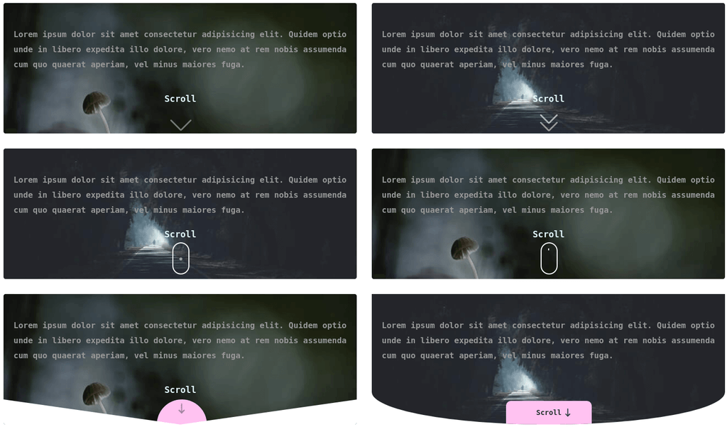
}Next, we will check the effects & animation one by one.
Effect 1 HTML
<a href="javascript:;" class="scroll-down arrow">
  <label>Scroll</label> <span></span>
</a>
CSS
.scroll-down.arrow span {
  position: absolute;
  display: inline-block;
  top: 20px;
  height: 30px;
  width: 2px;
  left: calc(50% - 1px);
  animation: animateArrow 1.5s infinite linear;
}
@keyframes animateArrow {
  0% {
    transform: translateY(0);
  }
  100% {
    transform: translateY(40px);
    opacity: 0;
  }
}
.scroll-down.arrow span::before,
.scroll-down.arrow span::after {
  position: absolute;
  content: "";
  width: 3px;
  height: 100%;
  top: 0;
  left: 0;
  background: #fff;
  border-radius: 3px;
}
.scroll-down.arrow span::before {
  transform-origin: bottom;
  transform: rotate(-45deg);
}
.scroll-down.arrow span::after {
  transform-origin: bottom;
  margin-left: -1px;
  transform: rotate(45deg);
}
Effect 2 HTML
<a href="javascript:;" class="scroll-down arrows">
  <label>Scroll</label> <span></span> <span></span> <span></span>
</a>
CSS
.scroll-down.arrows span {
  position: absolute;
  display: inline-block;
  top: 20px;
  height: 25px;
  width: 2px;
  left: calc(50% - 1px);
  animation: animateArrows 1.25s infinite linear;
}
@keyframes animateArrows {
  0%,
  40%,
  100% {
    opacity: 0;
  }
  75% {
    opacity: 1;
  }
}
.scroll-down.arrows span:first-child {
  top: 35px;
  animation-delay: 0s;
}
.scroll-down.arrows span:nth-child(2) {
  top: 35px;
  animation-delay: 0.33s;
}
.scroll-down.arrows span:last-child {
  top: 50px;
  animation-delay: 0.66s;
}
.scroll-down.arrows span::before,
.scroll-down.arrows span::after {
  position: absolute;
  content: "";
  width: 3px;
  height: 100%;
  top: 0;
  left: 0;
  background: #fff;
  border-radius: 3px;
}
.scroll-down.arrows span::before {
  transform-origin: bottom;
  transform: rotate(-45deg);
}
.scroll-down.arrows span::after {
  transform-origin: bottom;
  margin-left: -1px;
  transform: rotate(45deg);
}
Effect 3 HTML
<a href="javascript:;" class="scroll-down mouse effect1">
  <label>Scroll</label> <span></span>
</a>
CSS
.scroll-down.mouse {
  height: 100px;
}
.scroll-down.mouse span {
  position: relative;
  display: inline-block;
  width: 30px;
  height: 60px;
  border: 2px solid #fff;
  border-radius: 50px;
  top: 5px;
} /* Effect 3 */
.scroll-down.mouse.effect1 span::after {
  position: absolute;
  content: "";
  top: 10px;
  left: 0;
  right: 0;
  margin: 0 auto;
  width: 6px;
  height: 6px;
  border-radius: 100%;
  background: #fff;
  animation: animateMousePointer 1.5s infinite;
}
@keyframes animateMousePointer {
  0% {
    transform: translateY(0);
  }
  50% {
    opacity: 0.7;
  }
  100% {
    opacity: 0;
    transform: translateY(20px);
  }
}
Effect 4 HTML
<a href="javascript:;" class="scroll-down mouse effect2">
  <label>Scroll</label> <span></span>
</a>
CSS
.scroll-down.mouse {
  height: 100px;
}
.scroll-down.mouse span {
  position: relative;
  display: inline-block;
  width: 30px;
  height: 60px;
  border: 2px solid #fff;
  border-radius: 50px;
  top: 5px;
}
.scroll-down.mouse.effect2 span::after {
  position: absolute;
  content: "";
  top: 10px;
  left: 0;
  right: 0;
  margin: 0 auto;
  width: 2px;
  height: 20px;
  border-radius: 2px;
  background: #fff;
  animation: animateMouseScrollBar 1.5s infinite linear;
}
@keyframes animateMouseScrollBar {
  0% {
    height: 20px;
    top: 10px;
  }
  50% {
    height: 0;
    top: 30px;
  }
  50.01% {
    top: 10px;
  }
  100% {
    height: 20px;
  }
}
Effect 5 HTML
<a href="javascript:;" class="scroll-down semicircle">
  <label>Scroll</label>
  <span>
    <svg
      xmlns="http://www.w3.org/2000/svg"
      class="icon icon-tabler icon-tabler-arrow-narrow-down"
      width="30"
      height="30"
      viewBox="0 0 24 24"
      stroke-width="2"
      stroke="#2c3e50"
      fill="none"
      stroke-linecap="round"
      stroke-linejoin="round"
    >
      <path stroke="none" d="M0 0h24v24H0z" />
      <line x1="12" y1="5" x2="12" y2="19" />
      <line x1="16" y1="15" x2="12" y2="19" />
      <line x1="8" y1="15" x2="12" y2="19" />
    </svg>
  </span>
</a>
CSS
.card.shape {
  overflow: hidden;
}
.card.shape::before,
.card.shape::after {
  position: absolute;
  content: "";
  bottom: 0;
  width: 50%;
  height: 100px;
  background-color: #fff;
  z-index: 2;
}
.card.shape::before {
  left: 0;
  clip-path: polygon(0 50%, 0% 100%, 100% 100%);
}
.card.shape::after {
  left: 50%;
  clip-path: polygon(100% 50%, 0% 100%, 100% 100%);
}
.scroll-down.semicircle span {
  position: absolute;
  width: 100px;
  height: 100px;
  left: -10px;
  border-radius: 50%;
  background: #ffc2f0;
  bottom: -50px;
  display: inline-block;
  z-index: 1;
}
.scroll-down.semicircle span svg {
  position: absolute;
  left: 0;
  right: 0;
  margin: 0 auto;
  top: 15px;
  animation: animateLargeArrow 1.25s infinite linear;
}
@keyframes animateLargeArrow {
  0% {
    opacity: 0;
    top: 0;
  }
  25%,
  75% {
    opacity: 1;
  }
  50% {
    top: 15px;
  }
  100% {
    opacity: 0;
    top: 30px;
  }
}
Effect 6 HTML
<a href="javascript:;" class="scroll-down">
  <button class="scroll-down__btn">
    <label>Scroll</label>
    <svg
      xmlns="http://www.w3.org/2000/svg"
      class="icon icon-tabler icon-tabler-arrow-narrow-down"
      width="24"
      height="24"
      viewBox="0 0 24 24"
      stroke-width="2"
      stroke="#2c3e50"
      fill="none"
      stroke-linecap="round"
      stroke-linejoin="round"
    >
      <path stroke="none" d="M0 0h24v24H0z" />
      <line x1="12" y1="5" x2="12" y2="19" />
      <line x1="16" y1="15" x2="12" y2="19" />
      <line x1="8" y1="15" x2="12" y2="19" />
    </svg>
  </button>
</a>
CSS
.card.radius {
  border-radius: 0 0 50% 50% / 0 0 25% 25%;
  overflow: hidden;
}
.card.radius .scroll-down .scroll-down__btn {
  position: absolute;
  bottom: 0;
  left: 50%;
  transform: translateX(-50%);
  background: #ffc2f0;
  display: inline-block;
  padding: 15px 60px;
  border: none;
  font-family: monospace;
  font-weight: 600;
  border-radius: 10px 10px 0 0;
  cursor: pointer;
}
.card.radius .scroll-down .scroll-down__btn svg {
  position: absolute;
  top: 5px;
  right: 30px;
  animation: animateBtnArrow 1s infinite linear;
}
@keyframes animateBtnArrow {
  0%,
  100% {
    transform: translateY(5px);
  }
  50% {
    transform: translateY(10px);
  }
}
Effect 7 & 8 HTML
<a href="javascript:;" class="scroll-down pattern triangle">
  <label>Scroll</label>
  <span><img src="./svg/triangle.svg | circle.svg" /></span>
  <span><img src="./svg/triangle.svg" /></span>
  <span><img src="./svg/triangle.svg" /></span>
</a>
CSS
.scroll-down.pattern {
  height: 100px;
}
.scroll-down.pattern > label {
  display: inline-block;
  margin-bottom: 10px;
}
.scroll-down.pattern span {
  display: flex;
  flex-direction: column;
  width: 100%;
  animation: animatePattern 1.5s infinite;
}
.scroll-down.pattern span:nth-child(2) {
  animation-delay: 0.1s;
}
.scroll-down.pattern span:nth-child(3) {
  animation-delay: 0.2s;
}
.scroll-down.pattern span:nth-child(4) {
  animation-delay: 0.3s;
}
@keyframes animatePattern {
  0% {
    opacity: 0;
  }
  25% {
    opacity: 1;
    transform: translateY(3px);
  }
  75%,
  100% {
    opacity: 0;
    transform: translateY(3px);
  }
}
.scroll-down.pattern.circle span img {
  margin-bottom: 3px;
}
In effect 7 & 8, the markup will remains same. Only the SVG pattern is different. I hope, you guys will like the demo.