Magnetic Button Hover Effect
Create an interactive button that follows the cursor movement with magnetic attraction effect. The button should smoothly move towards the cursor when hovering nearby, with elastic easing and optional ripple effect on click.
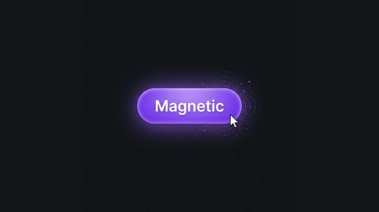
Create an engaging user experience with Magnetic Buttons that playfully track the cursor. This effect adds a premium, interactive feel to your calls to action. The button smoothly follows your mouse movement, creating a sense of weight and physical presence.
HTML Structure
We’ll use a semantic button structure. The text is wrapped in a span to allow for independent parallax movement if desired.
<div class="container">
  <!-- Variant 1: Standard Magnetic -->
  <button class="magnetic-btn">
    <span class="text">Hover Me</span>
  </button>

  <!-- Variant 2: High Intensity -->
  <button class="magnetic-btn intense">
    <span class="text">High Intensity</span>
  </button>
</div>
CSS Styling
The grid layout centers the buttons. The .magnetic-btn class handles the base styling, gradients, and the essential transition for the smooth return effect when the mouse leaves.
:root {
  --primary-bg: #1f1f24;
  --btn-bg-gradient: linear-gradient(180deg, rgba(167, 139, 250, 0.9) 0%, rgba(139, 92, 246, 0.9) 100%);
  --btn-glow-color: rgba(139, 92, 246, 0.6);
  --text-white: #ffffff;
}

body {
  background-color: var(--primary-bg);
  display: flex;
  align-items: center;
  justify-content: center;
  min-height: 300px;
  font-family: 'Inter', system-ui, sans-serif;
}

.container {
  display: flex;
  gap: 2rem;
  flex-wrap: wrap;
  justify-content: center;
}

/* Button Base Styles */
.magnetic-btn {
  position: relative;
  padding: 1.25rem 3rem;
  font-size: 1.125rem;
  font-weight: 600;
  color: var(--text-white);
  border: none;
  border-radius: 9999px; /* Pill shape */
  cursor: pointer;

  /* Complex Gradient Background */
  background:
    linear-gradient(180deg, rgba(255, 255, 255, 0.15) 0%, rgba(255, 255, 255, 0) 100%),
    linear-gradient(90deg, #9333ea, #7c3aed);
  background-blend-mode: overlay, normal;

  /* Inner shadows for depth */
  box-shadow:
    inset 0 2px 4px rgba(255, 255, 255, 0.3), /* Top highlight */
    inset 0 -2px 4px rgba(0, 0, 0, 0.2),      /* Bottom shadow */
    0 0 20px rgba(124, 58, 237, 0.5);         /* Outer Glow */

  /* Border Handling */
  border: 1px solid rgba(255, 255, 255, 0.1);

  /* Performance & Physics */
  transform: translate(0, 0);
  transition: transform 0.2s cubic-bezier(0.25, 0.46, 0.45, 0.94),
              box-shadow 0.3s ease,
              background 0.3s ease;
  will-change: transform;
  outline: none;
  user-select: none;
  overflow: hidden;
}

/* Hover State */
.magnetic-btn:hover {
  background:
    linear-gradient(180deg, rgba(255, 255, 255, 0.25) 0%, rgba(255, 255, 255, 0) 100%),
    linear-gradient(90deg, #a855f7, #8b5cf6);

  box-shadow:
    inset 0 2px 4px rgba(255, 255, 255, 0.4),
    inset 0 -2px 4px rgba(0, 0, 0, 0.2),
    0 0 35px rgba(124, 58, 237, 0.7), /* Stronger glow */
    0 0 10px rgba(139, 92, 246, 0.4);
}

/* Text Element */
.text {
  position: relative;
  z-index: 10;
  pointer-events: none;
  display: inline-block;
  text-shadow: 0 2px 4px rgba(0,0,0,0.2);
  transition: transform 0.1s ease;
  letter-spacing: 0.5px;
}

/* Intense Variant */
.magnetic-btn.intense {
    background:
    linear-gradient(180deg, rgba(255, 255, 255, 0.15) 0%, rgba(255, 255, 255, 0) 100%),
    linear-gradient(135deg, #ec4899, #8b5cf6);

    box-shadow:
    inset 0 2px 4px rgba(255, 255, 255, 0.3),
    inset 0 -2px 4px rgba(0, 0, 0, 0.2),
    0 0 20px rgba(236, 72, 153, 0.5);
}

.magnetic-btn.intense:hover {
    box-shadow:
    inset 0 2px 4px rgba(255, 255, 255, 0.4),
    inset 0 -2px 4px rgba(0, 0, 0, 0.2),
    0 0 40px rgba(236, 72, 153, 0.7);
}


/* Ripple Animation */
.ripple {
  position: absolute;
  top: 50%;
  left: 50%;
  transform: translate(-50%, -50%) scale(0);
  width: 150%;
  padding-bottom: 150%;
  border-radius: 50%;
  background: radial-gradient(circle, rgba(255, 255, 255, 0.4) 0%, rgba(255, 255, 255, 0) 70%);
  animation: ripple-effect 0.6s ease-out;
  pointer-events: none;
  z-index: 5;
  mix-blend-mode: overlay;
}

@keyframes ripple-effect {
  to {
      transform: translate(-50%, -50%) scale(2);
      opacity: 0;
  }
}
JavaScript Implementation
The JavaScript handles the physics simulation. It calculates the distance between the cursor and the button’s center, then moves the button a fraction of that distance to create the “magnetic” pull.
/* Select all buttons with the magnetic class */
const buttons = document.querySelectorAll('.magnetic-btn');

buttons.forEach(btn => {
  // Magnetic Effect
  btn.addEventListener('mousemove', function(e) {
    const rect = btn.getBoundingClientRect();
    const x = e.clientX - rect.left;
    const y = e.clientY - rect.top;

    // Calculate center of button
    const centerX = rect.width / 2;
    const centerY = rect.height / 2;

    // Get distance from center
    const deltaX = x - centerX;
    const deltaY = y - centerY;

    // Magnetic Intensity:
    // Higher number = Weaker pull (Standard: 5, Intense: 2.5)
    let intensity = 5;
    if (btn.classList.contains('intense')) {
        intensity = 2.5;
    }

    const moveX = deltaX / intensity;
    const moveY = deltaY / intensity;

    // Apply transform to button
    btn.style.transform = `translate(${moveX}px, ${moveY}px)`;

    // Parallax effect for text (moves slightly less than button for depth)
    const text = btn.querySelector('.text');
    if (text) {
        text.style.transform = `translate(${moveX * 0.2}px, ${moveY * 0.2}px)`;
    }
  });

  // Reset on Mouse Leave
  btn.addEventListener('mouseleave', function() {
    // Determine easing based on variant
    const ease = btn.classList.contains('intense') ?
                 'cubic-bezier(0.175, 0.885, 0.32, 1.275)' : // Elastic
                 'ease-out';

    btn.style.transition = `transform 0.4s ${ease}`;
    btn.style.transform = 'translate(0, 0)';

    const text = btn.querySelector('.text');
    if (text) {
        text.style.transition = `transform 0.4s ${ease}`;
        text.style.transform = 'translate(0, 0)';
    }

    // Remove transition inline style after animation to prevent interference with hover re-entry
    setTimeout(() => {
        btn.style.transition = '';
        if(text) text.style.transition = '';
    }, 400);
  });

  // Ripple Effect on Click
  btn.addEventListener('click', function(e) {
    // Create ripple element
    const ripple = document.createElement('span');
    ripple.classList.add('ripple');

    // Position ripple at click coordinates relative to button
    const rect = btn.getBoundingClientRect();
    const x = e.clientX - rect.left;
    const y = e.clientY - rect.top;

    // Since ripple is absolutely positioned, we set left/top
    // However, our CSS centers it with translate(-50%, -50%)
    // So we just need to set left/top to the click position.
    ripple.style.left = `${x}px`;
    ripple.style.top = `${y}px`;

    // Add to DOM
    this.appendChild(ripple);

    // Clean up
    setTimeout(() => {
      ripple.remove();
    }, 600);
  });
});