Liquid Button Effect
Buttons with liquid blob animations on hover. The blob stretches and squishes organically inside the button boundaries using CSS transforms and keyframe animations. Includes ripple effect on click.
Create buttons with organic liquid blob animations on hover. The blob stretches and squishes inside the button boundaries using CSS transforms and keyframe animations. A ripple effect on click adds tactile feedback. Pure CSS for the blob animation, minimal JavaScript for the ripple.
Features
- Liquid blob on hover — Organic stretch-and-squish animation using
scaleX,scaleY, andborder-radiuskeyframes with elastic easing. - Cursor-following bulge — Blob’s
transform-origintracks the cursor so the liquid bulges toward where you hover. - Shine sweep — A light streak sweeps across the button on hover for a glossy liquid reflection.
- Button lift — Subtle lift and scale on hover with bouncy easing.
- Ripple on click — JavaScript creates a ripple at the click position that expands and fades.
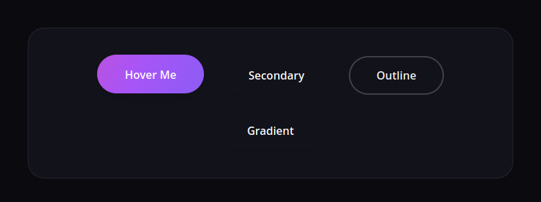
- Multiple variants — Primary, secondary, outline, and gradient styles.
HTML Structure
Wrap the blob in a container to separate the scaling transition from the rotation animation. This ensures a smooth entry/exit effect.
<div class="liquid-container">
  <button class="liquid-btn">
    <span class="liquid-btn__blob-container">
      <span class="liquid-btn__blob"></span>
    </span>
    <span class="liquid-btn__shine"></span>
    <span class="liquid-btn__text">Hover Me</span>
  </button>
</div>
CSS: Liquid Blob + Shine Sweep
The blob container handles the positioning (tracking the cursor) and the scaling transition. The inner blob handles the continuous organic rotation and morphing.
.liquid-btn {
  position: relative;
  display: inline-flex;
  align-items: center;
  justify-content: center;
  padding: 1rem 2.5rem;
  font-weight: 600;
  color: white;
  background: #1e1e24;
  border: none;
  border-radius: 9999px; /* Pill shape */
  outline: none;
  overflow: hidden;
  cursor: pointer;
  z-index: 1;
  transition: transform 0.2s ease, box-shadow 0.2s ease;
  box-shadow: 0 4px 6px -1px rgba(0, 0, 0, 0.1), 0 2px 4px -1px rgba(0, 0, 0, 0.06);
}

.liquid-btn:hover {
  transform: translateY(-2px);
  box-shadow: 0 10px 15px -3px rgba(0, 0, 0, 0.1), 0 4px 6px -2px rgba(0, 0, 0, 0.05);
}

.liquid-btn:active {
  transform: translateY(0);
}

/* Blob Container - Position & Scale */
.liquid-btn__blob-container {
  position: absolute;
  top: var(--y, 50%);
  left: var(--x, 50%);
  width: 250px;
  height: 250px;
  transform: translate(-50%, -50%) scale(0);
  transition: transform 0.4s cubic-bezier(0.33, 1, 0.68, 1);
  z-index: -1;
  pointer-events: none;
}

.liquid-btn:hover .liquid-btn__blob-container {
  transform: translate(-50%, -50%) scale(1.4);
}

/* Inner Blob - Rotation & Morphing */
.liquid-btn__blob {
  display: block;
  width: 100%;
  height: 100%;
  border-radius: 40% 50% 40% 50%;
  background: linear-gradient(135deg, #6366f1 0%, #a855f7 50%, #ec4899 100%);
  animation: rotate-blob 10s linear infinite;
}

@keyframes rotate-blob {
  0% { transform: rotate(0deg); border-radius: 40% 50% 40% 50%; }
  33% { transform: rotate(120deg); border-radius: 50% 40% 50% 40%; }
  66% { transform: rotate(240deg); border-radius: 40% 50% 50% 40%; }
  100% { transform: rotate(360deg); border-radius: 40% 50% 40% 50%; }
}

.liquid-btn__text {
  position: relative;
  z-index: 2;
  color: white; /* Text color on top of blob */
  pointer-events: none;
}

/* Secondary Variant */
.liquid-btn--secondary .liquid-btn__blob {
  background: linear-gradient(135deg, #3b82f6 0%, #06b6d4 100%);
}

/* Outline Variant Helper */
.liquid-btn--outline {
  background: transparent;
  color: #1e1e24; /* Dark text initially */
  box-shadow: inset 0 0 0 2px #e2e8f0;
}
.liquid-btn--outline:hover {
  color: white;
  box-shadow: inset 0 0 0 2px transparent;
}
.liquid-btn--outline .liquid-btn__blob {
  background: linear-gradient(135deg, #10b981 0%, #34d399 100%);
}

/* Shine effect */
.liquid-btn__shine {
  position: absolute;
  top: 0;
  left: 0;
  width: 100%;
  height: 100%;
  background: linear-gradient(to right, transparent, rgba(255,255,255,0.3), transparent);
  transform: skewX(-20deg) translateX(-150%);
  pointer-events: none;
  z-index: 3;
}

.liquid-btn:hover .liquid-btn__shine {
  animation: shine 0.75s cubic-bezier(0.19, 1, 0.22, 1);
}

@keyframes shine {
  0% { transform: skewX(-20deg) translateX(-150%); }
  100% { transform: skewX(-20deg) translateX(150%); }
}
CSS: Ripple Effect
The ripple is a circular element that scales from the click point and fades out.
.liquid-btn__ripple {
  position: absolute;
  border-radius: 50%;
  background: rgba(255, 255, 255, 0.5);
  transform: scale(0);
  animation: ripple 0.6s linear forwards;
  pointer-events: none;
  z-index: 0;
}

@keyframes ripple {
  to {
    transform: scale(4);
    opacity: 0;
  }
}
JavaScript: Cursor Tracking + Ripple
Uses mousemove to set CSS variables --x and --y which position the blob. The blob stays centered on the cursor but constrained within the button’s overflow.
document.querySelectorAll('.liquid-btn').forEach(btn => {
  // Cursor tracking for blob
  btn.addEventListener('mousemove', (e) => {
    const rect = btn.getBoundingClientRect();
    const x = e.clientX - rect.left;
    const y = e.clientY - rect.top;

    // Set variables for blob position
    btn.style.setProperty('--x', `${x}px`);
    btn.style.setProperty('--y', `${y}px`);
  });

  // Ripple effect on click
  btn.addEventListener('click', (e) => {
    const rect = btn.getBoundingClientRect();
    const x = e.clientX - rect.left;
    const y = e.clientY - rect.top;

    const ripple = document.createElement('span');
    ripple.classList.add('liquid-btn__ripple');

    const size = Math.max(rect.width, rect.height);
    ripple.style.width = `${size}px`;
    ripple.style.height = `${size}px`;
    ripple.style.left = `${x - size/2}px`;
    ripple.style.top = `${y - size/2}px`;

    btn.appendChild(ripple);

    setTimeout(() => {
      ripple.remove();
    }, 600);
  });
});
Resources
- Demo: Use the Demo button to see the liquid blob animation and ripple effect in action.
- Download: Use the Download button to get the full source (HTML, CSS, JS) for the liquid button effect.
Tips
- Adjust
scaleXandscaleYvalues in the keyframes to change how much the blob stretches or squishes. - Tune
animation-duration(e.g.0.6sor1s) for faster or slower liquid motion. - Use
border-radiusvalues in the keyframes for more organic morphing between shapes. - For different colors, add modifier classes (e.g.
.liquid-btn--secondary) and override the blob background gradient.