Images Shape and Transformation on Hover Using CSS Clip Path
Images shape and their transformation on hover using css clip-path paroperty.
In this post, we’ll explore how to create images shape and achieve animations and hover effects using css clip-path and other properties.
First, we will create the image shapes using the perspective and transformation property.Then we will add mouse over effect.
Let’s begin with the HTML structure.
HTML Structure
<!-- Random -->
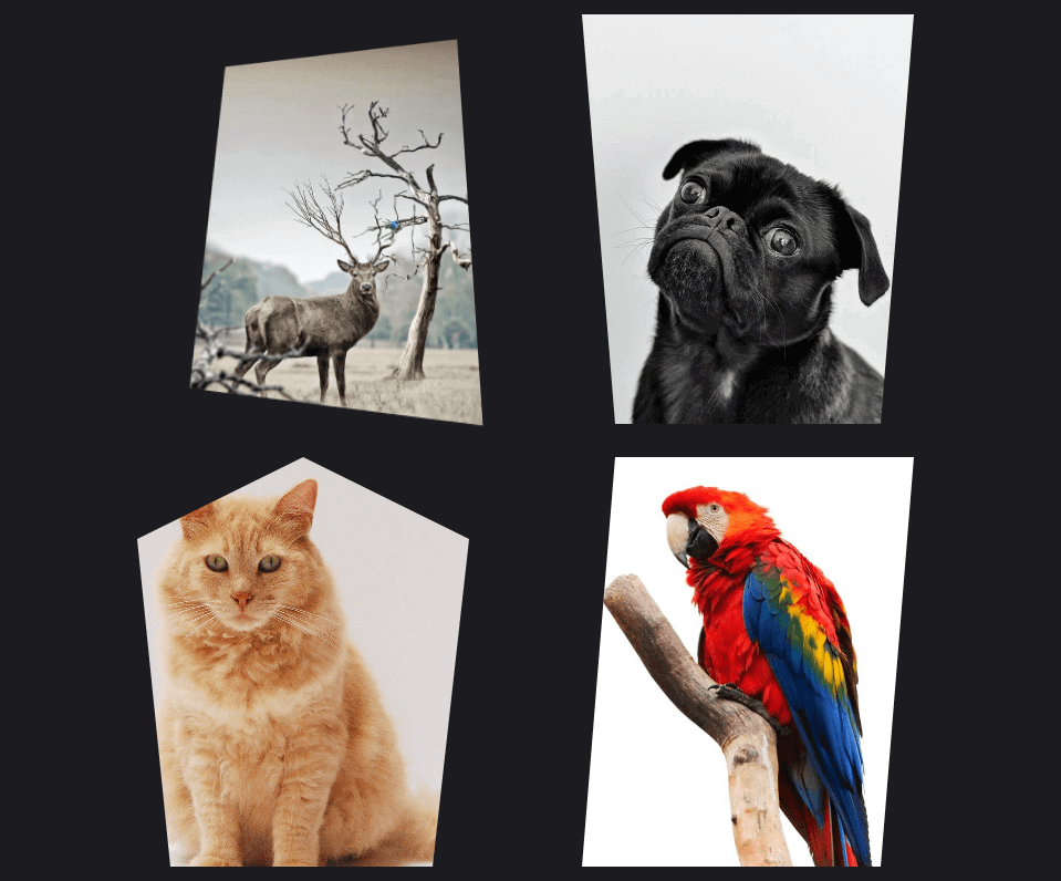
<div class="card random">
<div class="card__image" dd-bg="images/antler.jpg"></div>
</div>
<!-- Trapezoid -->
<div class="card trapezoid">
<div class="card__image" dd-bg="images/dog.jpg"></div>
</div>
<!-- Pentagon -->
<div class="card pentagon">
<div class="card__image" dd-bg="images/cat.jpg"></div>
</div>
<!-- Parallelogram -->
<div class="card parallelogram">
<div class="card__image" dd-bg="images/redparrot.jpg"></div>
</div>The images for these cards are set as background images using CSS, offering flexibility and control over the visual representation.
Our CSS styling encompasses both the card design and the animations. Each card holds a distinct shape and comes alive on hover effect:
CSS Style
/* Card design */
.card {
  width: 320px;
  height: 420px;
  padding: 0 30px;
  margin: 0 auto;
  margin-bottom: 30px;
  cursor: pointer;
  -webkit-transition: all 0.25s;
  -o-transition: all 0.25s;
  transition: all 0.25s;
  perspective: 600px;
} /* Image */
.card .card__image {
  background-size: cover !important;
  width: 100%;
  height: 100%;
  -webkit-transition: all 0.25s;
  -moz-transition: all 0.25s;
  -ms-transition: all 0.25s;
  -o-transition: all 0.25s;
  transition: all 0.25s;
}
.card:hover .card__image {
  -webkit-transform: rotateX(15deg);
  -ms-transform: rotateX(15deg);
  -o-transform: rotateX(15deg);
  transform: rotateX(15deg);
} /* Ranbdom */
.card.random .card__image {
  -webkit-clip-path: polygon(3% 8%, 100% 0%, 94% 90%, 7% 100%);
  -o-clip-path: polygon(3% 8%, 100% 0%, 94% 90%, 7% 100%);
  clip-path: polygon(3% 8%, 100% 0%, 94% 90%, 7% 100%);
  stroke: yellow;
  stroke-width: 8px;
}
.card.random:hover .card__image {
  -webkit-clip-path: polygon(16% 9%, 100% 0%, 99% 99%, 9% 90%);
  -o-clip-path: polygon(16% 9%, 100% 0%, 99% 99%, 9% 90%);
  clip-path: polygon(16% 9%, 100% 0%, 99% 99%, 9% 90%);
} /* Trapezoid */
.card.trapezoid .card__image {
  -webkit-clip-path: polygon(0 0, 100% 0, 90% 100%, 10% 100%);
  -o-clip-path: polygon(0 0, 100% 0, 90% 100%, 10% 100%);
  clip-path: polygon(0 0, 100% 0, 90% 100%, 10% 100%);
}
.card.trapezoid:hover .card__image {
  -webkit-clip-path: polygon(10% 0, 90% 0, 100% 100%, 0% 100%);
  -o-clip-path: polygon(10% 0, 90% 0, 100% 100%, 0% 100%);
  clip-path: polygon(10% 0, 90% 0, 100% 100%, 0% 100%);
} /* Pentagon */
.card.pentagon .card__image {
  -webkit-clip-path: polygon(50% 0%, 100% 20%, 89% 100%, 10% 100%, 0 20%);
  -o-clip-path: polygon(50% 0%, 100% 20%, 89% 100%, 10% 100%, 0 20%);
  clip-path: polygon(50% 0%, 100% 20%, 89% 100%, 10% 100%, 0 20%);
}
.card.pentagon:hover .card__image {
  -webkit-clip-path: polygon(50% 0%, 95% 20%, 100% 100%, 0 100%, 5% 20%);
  -o-clip-path: polygon(50% 0%, 95% 20%, 100% 100%, 0 100%, 5% 20%);
  clip-path: polygon(50% 0%, 95% 20%, 100% 100%, 0 100%, 5% 20%);
} /* Parallelogram */
.card.parallelogram .card__image {
  -webkit-clip-path: polygon(10% 0, 100% 0%, 90% 100%, 0% 100%);
  -o-clip-path: polygon(10% 0, 100% 0%, 90% 100%, 0% 100%);
  clip-path: polygon(10% 0, 100% 0%, 90% 100%, 0% 100%);
}
.card.parallelogram:hover .card__image {
  -webkit-clip-path: polygon(0 0, 90% 4%, 100% 96%, 10% 100%);
  -o-clip-path: polygon(0 0, 90% 4%, 100% 96%, 10% 100%);
  clip-path: polygon(0 0, 90% 4%, 100% 96%, 10% 100%);
}
We explore various shapes like random, trapezoid, pentagon, and parallelogram, each with its unique clip-path settings and animations on hover.
Javascript
First include jQuery (https://jquery.com/download/)
$("[dd-bg]").each(function () {
  $(this).css("background", "url(" + $(this).attr("dd-bg") + ")");
});
Experiment with shapes, styles, and effects to create a unique and engaging user experience.
Happy designing! Feel free to share the snippet with everyone.