Glowing Gradient Cards
Create premium card components with animated gradient borders that rotate 360 degrees continuously. Features a glassmorphism backdrop, smooth conic-gradient transitions, and a sophisticated glow effect on hover.
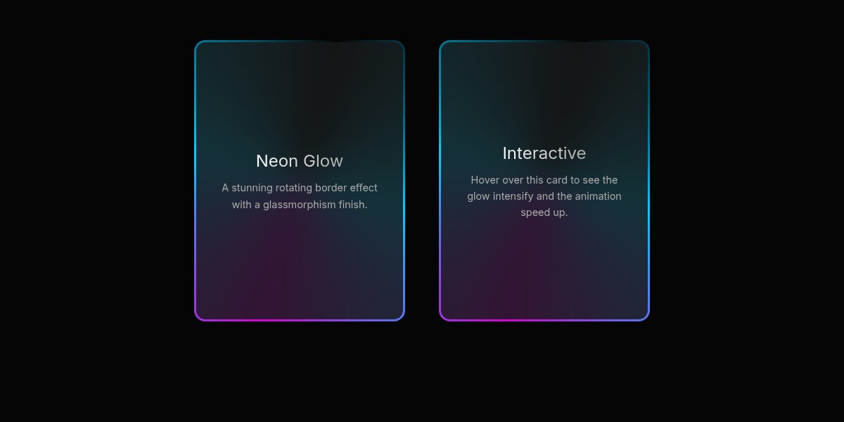
Elevate your UI with these Glowing Gradient Cards. They feature a continuously rotating gradient border created with conic-gradient and a glassmorphism backdrop. On hover, the cards lift slightly and emit a soft, pulsing glow, adding a layer of depth and interactivity.
HTML Structure
The structure consists of a container for layout and the card component itself. The .gradient-card serves as the main wrapper for the effect, containing the .card-content. We also add a .glow-layer for the enhanced hover effect.
<div class="container">
  <!-- Card 1 -->
  <div class="gradient-card">
    <div class="glow-layer"></div>
    <div class="card-content">
      <h3>Neon Glow</h3>
      <p>A stunning rotating border effect with a glassmorphism finish.</p>
    </div>
  </div>

  <!-- Card 2 -->
  <div class="gradient-card">
    <div class="glow-layer"></div>
    <div class="card-content">
      <h3>Interactive</h3>
      <p>Hover over this card to see the glow intensify and the animation speed up.</p>
    </div>
  </div>
</div>
CSS Styling
The magic happens with the ::before pseudo-element on .gradient-card, which uses a conic-gradient that is animated to rotate. The ::after pseudo-element creates the inner dark background with a blur, creating the border appearance.
:root {
  --card-bg: #101010;
  --card-content-bg: rgba(23, 23, 23, 0.85);
  --border-width: 3px;
  --card-radius: 16px;
  --gradient-1: #00ccff;
  --gradient-2: #d400d4;
}

body {
  background-color: #050505;
  color: #ffffff;
  font-family: 'Inter', sans-serif;
  display: flex;
  justify-content: center;
  align-items: center;
  min-height: 400px;
}

.gradient-card {
  position: relative;
  width: 300px;
  height: 400px;
  border-radius: var(--card-radius);
  color: white;
  display: flex;
  justify-content: center;
  align-items: center;
  overflow: hidden;
  transition: transform 0.3s ease, box-shadow 0.3s ease;
  z-index: 1;
}

/* Rotating Gradient Border */
.gradient-card::before {
  content: '';
  position: absolute;
  top: 50%; left: 50%;
  width: 250%; height: 250%;
  background: conic-gradient(
    from 0deg,
    transparent 0deg,
    var(--gradient-1) 90deg,
    var(--gradient-2) 180deg,
    var(--gradient-1) 270deg,
    transparent 360deg
  );
  transform: translate(-50%, -50%);
  animation: rotate-border 4s linear infinite;
  z-index: -2;
}

/* Inner Background (Glassmorphism) */
.gradient-card::after {
  content: '';
  position: absolute;
  inset: var(--border-width);
  background: var(--card-content-bg);
  border-radius: calc(var(--card-radius) - var(--border-width));
  z-index: -1;
  backdrop-filter: blur(20px);
}

.card-content {
  position: relative;
  z-index: 2;
  padding: 2rem;
  text-align: center;
}

/* Typography & Animations */
.gradient-card h3 {
  font-size: 1.5rem;
  margin-bottom: 0.5rem;
  background: linear-gradient(to right, #fff, #aaa);
  -webkit-background-clip: text;
  -webkit-text-fill-color: transparent;
}

.gradient-card p {
  font-size: 0.9rem;
  color: #aaa;
  line-height: 1.6;
}

@keyframes rotate-border {
  from { transform: translate(-50%, -50%) rotate(0deg); }
  to { transform: translate(-50%, -50%) rotate(360deg); }
}

/* Hover Effects */
.gradient-card:hover {
  transform: translateY(-5px);
  box-shadow: 0 10px 30px -10px rgba(0, 204, 255, 0.3);
}

.gradient-card:hover::before {
  animation-duration: 2s;
}

/* Optional Glow Layer */
.glow-layer {
  position: absolute;
  top: 0; left: 0;
  width: 100%; height: 100%;
  border-radius: var(--card-radius);
  background: conic-gradient(
    from 0deg,
    transparent 0deg,
    var(--gradient-1) 90deg,
    var(--gradient-2) 180deg,
    var(--gradient-1) 270deg,
    transparent 360deg
  );
  filter: blur(20px);
  opacity: 0;
  transition: opacity 0.3s ease;
  z-index: -3;
  transform: scale(0.9);
}

.gradient-card:hover .glow-layer {
  opacity: 0.4;
  animation: rotate-border 4s linear infinite;
}
JavaScript (Optional)
This effect is pure CSS, but you can add vanilla JavaScript to create tilt effects or dynamic color changes based on cursor position if you want to push it further.