Fullpage Vertical Content Slider
Creating an Interactive Full Page Vertical Content Slider using CSS and JavaScript.
In this tutorial, we’ll walk you through the process of crafting a full-page vertical content slider using the power of pure CSS and fundamental JavaScript.
Step 1: Structuring the Page
Begin by segmenting the content into two key sections: the sidebar and the main content area.
<div class="slider-wrapper">
<!-- Sidebar -->
<div class="sidebar">
<!-- Tab list goes here -->
</div>
<!-- Main Content -->
<div class="main-content">
<!-- Slide content goes here -->
</div>
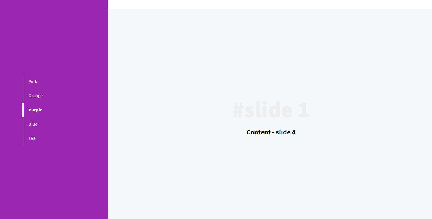
</div>Step 2: Crafting the Sidebar Tab List Create a clickable tab list within the sidebar to navigate between different slides.
And register the click event on the tab that will move the body to the content of the selected slide. The background of the sidebar will change according to the active tab. We will use *data attribute [dd-sidebar-tab] to change the background color of the sidebar.
Example of data-attribute to store bg color value.
dd-active-tab=“2” dd-sidebar-tab=“#ff9800”
- And, you just need to replace content tab with your own content.
Code Structure
HTML Structure
<div class="dd-wrapper">
  <!-- Sidebar -->
  <div class="sidebar">
    <div class="sidebar-content">
      <div class="sidebar-list">
        <ul class="sidebar-list-menu">
          <span class="sidebar-list-menu-active-bar"></span>
          <li>
            <a
              href="#content_1"
              class="active"
              dd-active-tab="1"
              dd-sidebar-tab="#ff4081"
              >Pink</a
            >
          </li>
          <li>
            <a href="#content_2" dd-active-tab="2" dd-sidebar-tab="#ff9800"
              >Orange</a
            >
          </li>
          <li>
            <a href="#content_3" dd-active-tab="3" dd-sidebar-tab="#9b26af"
              >Purple</a
            >
          </li>
          <li>
            <a href="#content_4" dd-active-tab="4" dd-sidebar-tab="#3f5ab5"
              >Blue</a
            >
          </li>
          <li>
            <a href="#content_5" dd-active-tab="5" dd-sidebar-tab="#008081"
              >Teal</a
            >
          </li>
        </ul>
      </div>
    </div>
  </div>
  <!-- Content part -->
  <div class="content">
    <div id="content_1" class="content-container">
      <div class="content--center">
        <span class="title-lite">#slide 1</span>
        <h2 class="title">Content - slide 1</h2>
      </div>
    </div>
    <div id="content_2" class="content-container">
      <div class="content--center">
        <span class="title-lite">#slide 2</span>
        <h2 class="title">Content - slide 2</h2>
      </div>
    </div>
    <div id="content_3" class="content-container">
      <div class="content--center">
        <span class="title-lite">#slide 3</span>
        <h2 class="title">Content - slide 3</h2>
      </div>
    </div>
    <div id="content_4" class="content-container">
      <div class="content--center">
        <span class="title-lite">#slide 1</span>
        <h2 class="title">Content - slide 4</h2>
      </div>
    </div>
    <div id="content_5" class="content-container">
      <div class="content--center">
        <span class="title-lite">#slide 5</span>
        <h2 class="title">Content - slide 5</h2>
      </div>
    </div>
  </div>
</div>
CSS
body {
  position: relative;
  height: 100%;
  width: 100%;
}
.title {
  width: 100%;
  text-align: center;
}
.title-lite {
  display: inline-block;
  font-weight: 900;
  width: 100%;
  text-align: center;
  font-size: 5em;
  color: #eee;
}
.sidebar {
  float: left;
  width: 25%;
  height: 100vh;
}
.sidebar-content {
  position: fixed;
  width: 25%;
  height: 100%;
  background: #ff4081;
  -webkit-transition: all 1s ease-in;
  -moz-transition: all 1s ease-in;
  -ms-transition: all 1s ease-in;
  -o-transition: all 1s ease-in;
  transition: all 1s ease-in;
}
.sidebar-list {
  position: absolute;
  top: 50%;
  -webkit-transform: translateY(-50%);
  -moz-transform: translateY(-50%);
  -ms-transform: translateY(-50%);
  -o-transform: translateY(-50%);
  transform: translateY(-50%);
}
.sidebar-list-menu {
  position: relative;
  list-style: none;
  margin-left: 100px;
  padding: 0;
}
.sidebar-list-menu::after {
  position: absolute;
  content: " ";
  top: 0;
  bottom: 0;
  left: -20px;
  width: 2px;
  height: 100%;
  background: #333;
  z-index: 9;
}
.sidebar-list-menu li a {
  position: relative;
  display: inline-block;
  line-height: 50px;
  font-weight: 600;
  cursor: pointer;
  color: #fff;
  text-decoration: none;
}
.sidebar-list-menu li a.active {
  font-weight: 900;
}
.sidebar-list-menu-active-bar {
  position: absolute;
  width: 6px;
  height: 50px;
  background: #fff;
  top: 0;
  left: -22px;
  z-index: 999;
  -webkit-transition: all 0.5s;
  -moz-transition: all 0.5s;
  -ms-transition: all 0.5s;
  -o-transition: all 0.5s;
  transition: all 0.5s;
  transition-delay: 0;
}
.content {
  display: inline-block;
  width: 75%;
}
.content > .content-container {
  width: 100%;
  height: 100vh;
}
.content > .content-container:nth-child(n) {
  background: #fff;
}
.content > .content-container:nth-child(2n) {
  background: #f5f7f9;
}
.content--center {
  position: relative;
  width: 100vw;
  height: 100vh;
  display: table-cell;
  vertical-align: middle;
}
@media (max-width: 768px) {
  .sidebar,
  .sidebar-content {
    width: 35%;
  }
  .content {
    width: 65%;
  }
  .sidebar-list-menu {
    margin-left: 15px;
  }
  .sidebar-list-menu::after {
    left: -10px;
  }
  .sidebar-list-menu-active-bar {
    left: -12px;
  }
}
Then, we will manipulate the tabs using the Javascript/jQuery.
In the first event, we will trigger the click and apply the CSS classes. And in the second event, we will scroll/navigate the content portion to the specific ID.
Javascript/jQuery
// Trigger event on tab click
$("[dd-sidebar-tab]").on("click", function () {
  $(".sidebar-list-menu-active-bar").css(
    "margin-top",
    ($(this).attr("dd-active-tab") - 1) * $(this).height()
  );
  $(".sidebar-content").css("background", $(this).attr("dd-sidebar-tab"));
  $(".sidebar-list-menu li a").removeClass("active");
  $(this).addClass("active");
  $("html, body").animate(
    { scrollTop: $("#content_" + $(this).attr("dd-active-tab")).offset().top },
    500
  );
});
// Scroll event
$(window).scroll(function (event) {
  var scrollPos = $(document).scrollTop();
  $(".sidebar-list-menu li a").each(function () {
    var currLink = $(this);
    var refElement = $(currLink.attr("href"));
    if (
      refElement.position().top <= scrollPos &&
      refElement.position().top + refElement.height() > scrollPos
    ) {
      $(".sidebar-list-menu li a").removeClass("active");
      currLink.addClass("active");
      $(".sidebar-list-menu-active-bar").css(
        "margin-top",
        (currLink.attr("dd-active-tab") - 1) * currLink.height()
      );
      $(".sidebar-content").css("background", currLink.attr("dd-sidebar-tab"));
    }
  });
});
You can also use this demo as a single page website template. You can customize the snippet according to your need.
Feel free to share this content with others!