Cursor-Attraction Button Effect
An interactive button that follows the cursor with magnetic attraction, elastic easing, and optional ripple on click. Multiple intensity variants included.
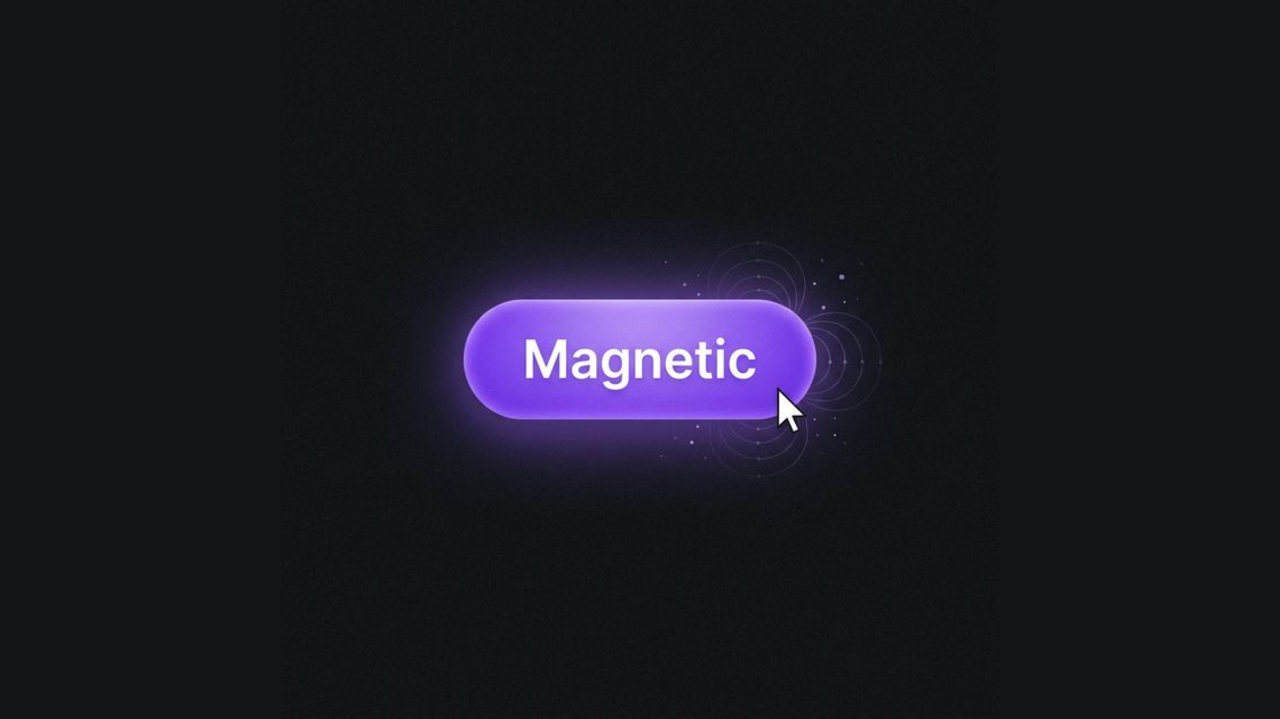
A Cursor-Attraction Button follows the mouse when hovering nearby, with smooth elastic motion and optional click ripple. This snippet provides several intensity variants so you can tune how strongly the button is “pulled” toward the cursor.
HTML Structure
Use a wrapper for layout and a button with an inner span for the label (and optional parallax).
<div class="container">
  <!-- Subtle pull -->
  <button class="attr-btn attr-btn--subtle">
    <span class="attr-btn__text">Subtle</span>
  </button>

  <!-- Medium (default) -->
  <button class="attr-btn">
    <span class="attr-btn__text">Hover Me</span>
  </button>

  <!-- Strong pull -->
  <button class="attr-btn attr-btn--strong">
    <span class="attr-btn__text">Strong</span>
  </button>
</div>
CSS
All styling and the ripple animation are done with CSS. The button uses transform for movement and transition for elastic return.
:root {
  --attr-bg: #1a1a1f;
  --attr-btn: #6366f1;
  --attr-btn-hover: #4f46e5;
  --attr-text: #fff;
}

body {
  background: var(--attr-bg);
  min-height: 100vh;
  margin: 0;
  display: flex;
  align-items: center;
  justify-content: center;
  font-family: system-ui, sans-serif;
}

.container {
  display: flex;
  gap: 2rem;
  flex-wrap: wrap;
  justify-content: center;
  padding: 2rem;
}

.attr-btn {
  position: relative;
  padding: 1rem 2.5rem;
  font-size: 1rem;
  font-weight: 600;
  color: var(--attr-text);
  background: var(--attr-btn);
  border: none;
  border-radius: 9999px;
  cursor: pointer;
  overflow: hidden;
  transform: translate(0, 0);
  transition: transform 0.2s ease-out, box-shadow 0.25s ease, background 0.2s ease;
  will-change: transform;
  outline: none;
  user-select: none;
}

.attr-btn:hover {
  background: var(--attr-btn-hover);
  box-shadow: 0 8px 24px -4px rgba(99, 102, 241, 0.45);
}

.attr-btn--subtle { background: #374151; }
.attr-btn--subtle:hover { background: #4b5563; box-shadow: 0 8px 20px -4px rgba(0,0,0,0.3); }

.attr-btn--strong {
  background: linear-gradient(135deg, #ec4899, #8b5cf6);
}
.attr-btn--strong:hover {
  box-shadow: 0 12px 28px -4px rgba(236, 72, 153, 0.45);
}

.attr-btn__text {
  position: relative;
  z-index: 10;
  pointer-events: none;
  display: inline-block;
  transition: transform 0.1s ease;
}

.attr-btn__ripple {
  position: absolute;
  left: 50%;
  top: 50%;
  transform: translate(-50%, -50%) scale(0);
  width: 100%;
  padding-bottom: 100%;
  border-radius: 50%;
  background: rgba(255,255,255,0.35);
  animation: attr-ripple 0.55s linear forwards;
  pointer-events: none;
  z-index: 5;
}

@keyframes attr-ripple {
  to {
    transform: translate(-50%, -50%) scale(2.8);
    opacity: 0;
  }
}
JavaScript (cursor attraction + ripple)
A small script measures the cursor offset from the button center and applies a proportional translate. Intensity is controlled by a divisor (e.g. 5 = subtle, 2.5 = strong). On mouseleave, transition is set to an elastic curve and transform is reset.
document.querySelectorAll('.attr-btn').forEach(btn => {
  let intensity = 5;
  if (btn.classList.contains('attr-btn--subtle')) intensity = 8;
  if (btn.classList.contains('attr-btn--strong')) intensity = 2.5;

  btn.addEventListener('mousemove', (e) => {
    const r = btn.getBoundingClientRect();
    const cx = r.width / 2, cy = r.height / 2;
    const dx = (e.clientX - r.left) - cx, dy = (e.clientY - r.top) - cy;
    const tx = dx / intensity, ty = dy / intensity;
    btn.style.transform = `translate(${tx}px, ${ty}px)`;
    const text = btn.querySelector('.attr-btn__text');
    if (text) text.style.transform = `translate(${tx * 0.2}px, ${ty * 0.2}px)`;
  });

  btn.addEventListener('mouseleave', () => {
    const ease = 'cubic-bezier(0.175, 0.885, 0.32, 1.275)';
    btn.style.transition = `transform 0.4s ${ease}`;
    btn.style.transform = 'translate(0, 0)';
    const text = btn.querySelector('.attr-btn__text');
    if (text) { text.style.transition = `transform 0.4s ${ease}`; text.style.transform = 'translate(0, 0)'; }
    setTimeout(() => { btn.style.transition = ''; if (text) text.style.transition = ''; }, 400);
  });

  btn.addEventListener('click', (e) => {
    const ripple = document.createElement('span');
    ripple.className = 'attr-btn__ripple';
    const r = btn.getBoundingClientRect();
    ripple.style.left = (e.clientX - r.left) + 'px';
    ripple.style.top = (e.clientY - r.top) + 'px';
    btn.appendChild(ripple);
    setTimeout(() => ripple.remove(), 600);
  });
});
Use the Subtle variant for a light pull, default for medium, and Strong for a more pronounced magnetic feel. The demo is HTML and CSS for layout and visuals, with a small amount of JavaScript for cursor tracking and ripple.