Creative Input Text Box Effects with CSS
Creative input text box element styles, animation & hover effects. Ex: shutter effects, glow effects, border animation, etc...
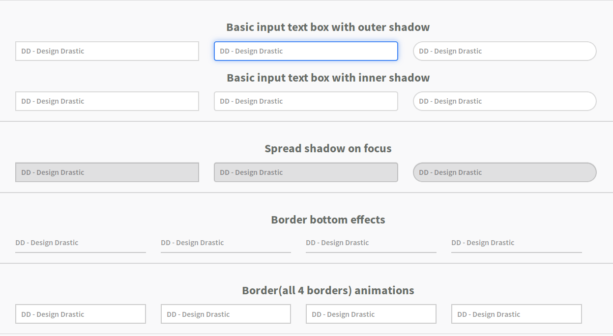
In this article, we’re going to explore various kind of int input text box effects and hover/focus animation. We’ll explore various styles and effects that you can apply to your input fields, enhancing the user experience on your web forms.
Let’s get started by showcasing a variety of input text box effects that you can achieve using pure CSS. From basic shadow effects to intricate animations, we’ve got it covered. You can customize these effects to match the style of your website.
Our primary class is
.form-input, which applies to all input elements, and we can further enhance their effects by adding additional classes.
HTML
<input type="text" class="form-input basic" placeholder="DD - Design Drastic" />
<input
  type="text"
  class="form-input basic smooth-corner"
  placeholder="DD - Design Drastic"
/>
<input
  type="text"
  class="form-input basic round"
  placeholder="DD - Design Drastic"
/>
<input
  type="text"
  class="form-input basic shadow-inset"
  placeholder="DD - Design Drastic"
/>
<input
  type="text"
  class="form-input basic smooth-corner shadow-inset"
  placeholder="DD - Design Drastic"
/>
<input
  type="text"
  class="form-input basic round shadow-inset"
  placeholder="DD - Design Drastic"
/>
<input
  type="text"
  class="form-input spread-shadow"
  placeholder="DD - Design Drastic"
/>
<input
  type="text"
  class="form-input spread-shadow smooth-corner"
  placeholder="DD - Design Drastic"
/>
<input
  type="text"
  class="form-input spread-shadow round"
  placeholder="DD - Design Drastic"
/>
<input
  type="text"
  class="form-input glow-shadow"
  placeholder="DD - Design Drastic"
/>
<input
  type="text"
  class="form-input glow-shadow smooth-corner"
  placeholder="DD - Design Drastic"
/>
<input
  type="text"
  class="form-input glow-shadow round"
  placeholder="DD - Design Drastic"
/>
<input
  type="text"
  class="form-input border-dashed"
  placeholder="DD - Design Drastic"
/>
<input
  type="text"
  class="form-input border-dashed smooth-corner"
  placeholder="DD - Design Drastic"
/>
<input
  type="text"
  class="form-input border-dashed round"
  placeholder="DD - Design Drastic"
/>
<input
  type="text"
  class="form-input shutter"
  placeholder="DD - Design Drastic"
/>
<input
  type="text"
  class="form-input shutter smooth-corner"
  placeholder="DD - Design Drastic"
/>
<input
  type="text"
  class="form-input shutter round"
  placeholder="DD - Design Drastic"
/>
<input
  type="text"
  class="form-input shutter-in"
  placeholder="DD - Design Drastic"
/>
<input
  type="text"
  class="form-input shutter-in smooth-corner"
  placeholder="DD - Design Drastic"
/>
<div class="form-group">
  <input
    type="tyext"
    class="form-input border-bottom"
    placeholder="DD - Design Drastic"
  />
  <span class="border-bottom-animation left"></span>
</div>
<div class="form-group">
  <input
    type="tyext"
    class="form-input border-bottom"
    placeholder="DD - Design Drastic"
  />
  <span class="border-bottom-animation right"></span>
</div>
<div class="form-group">
  <input
    type="tyext"
    class="form-input border-bottom"
    placeholder="DD - Design Drastic"
  />
  <span class="border-bottom-animation center"></span>
</div>
<div class="form-group">
  <input
    type="tyext"
    class="form-input border-bottom"
    placeholder="DD - Design Drastic"
  />
  <span class="border-bottom-animation both-side"></span>
</div>
<div class="form-group">
  <input
    type="tyext"
    class="form-input border-animation set-1"
    placeholder="DD - Design Drastic"
  />
  <span class="border-line-animation top-bottom"></span>
  <span class="border-line-animation left-right"></span>
</div>
<div class="form-group">
  <input
    type="tyext"
    class="form-input border-animation set-2"
    placeholder="DD - Design Drastic"
  />
  <span class="border-line-animation top-bottom"></span>
  <span class="border-line-animation left-right"></span>
</div>
<div class="form-group">
  <input
    type="tyext"
    class="form-input border-animation set-3"
    placeholder="DD - Design Drastic"
  />
  <span class="border-line-animation top"></span>
  <span class="border-line-animation left"></span>
  <span class="border-line-animation bottom"></span>
  <span class="border-line-animation right"></span>
</div>
<div class="form-group">
  <input
    type="tyext"
    class="form-input border-animation set-4"
    placeholder="DD - Design Drastic"
  />
  <span class="border-line-animation top-bottom"></span>
  <span class="border-line-animation left-right"></span>
</div>
CSS Styles
* {
  box-sizing: border-box;
}
.form-group {
  position: relative;
}
.form-input {
  position: relative;
  font-family: "Source Sans Pro", sans-serif;
  font-weight: 600;
  width: 100%;
  height: 40px;
  border: none;
  padding: 0 10px;
  box-shadow: none;
  outline: none;
  -webkit-transition: all 0.5s ease;
  -moz-transition: all 0.5s ease;
  -ms-transition: all 0.5s ease;
  -o-transition: all 0.5s ease;
  transition: all 0.5s ease;
}
.form-input.smooth-corner {
  border-radius: 5px;
}
.form-input.round {
  border-radius: 50px;
}
.form-input.basic {
  border: 2px solid rgba(0, 0, 0, 0.15);
}
.form-input.basic:hover {
  border-color: rgba(0, 0, 0, 0.35);
  box-shadow: 0 0 5px rgba(0, 0, 0, 0.2);
}
.form-input.basic:focus {
  border-color: #4285f4;
  box-shadow: 0 0 10px rgba(66, 133, 244, 0.5);
}
.form-input.basic.shadow-inset:hover {
  box-shadow: 0 0 5px rgba(0, 0, 0, 0.2) inset;
}
.form-input.basic.shadow-inset:focus {
  box-shadow: 0 0 10px rgba(66, 133, 244, 0.5) inset;
} /* Spread shadow */
.form-input.spread-shadow {
  border: 2px solid rgba(0, 0, 0, 0.15);
  background: rgba(0, 0, 0, 0.1);
}
.form-input.spread-shadow:focus {
  background: #fff;
  box-shadow: 0 0 40px 5px rgba(0, 0, 0, 0.2);
} /* Glow shadow */
.form-input.glow-shadow {
  border: 0;
  background: rgba(0, 0, 0, 0.1);
}
.form-input.glow-shadow:focus {
  box-shadow: 0 0 0 2px #4285f4;
  background: #fff;
  border-color: #4285f4;
} /* Chagne Border */
.form-input.border-dashed {
  border: 2px solid rgba(0, 0, 0, 0.15);
  background: rgba(0, 0, 0, 0.1);
}
.form-input.border-dashed:focus {
  border: 2px dashed #999;
  background: #fff;
  border-color: #4285f4;
} /* Shutter */
.form-input.shutter {
  border: 2px solid rgba(0, 0, 0, 0.15);
  box-shadow: 0 20px 0 0 #d5d5d5 inset, 0 -20px 0 0 #d5d5d5 inset;
}
.form-input.shutter:focus {
  box-shadow: none;
  border-color: rgba(0, 0, 0, 0.3);
}
.form-input.shutter-in {
  border-bottom: 2px solid rgba(0, 0, 0, 0.2);
  background: transparent;
}
.form-input.shutter-in:focus {
  border-color: rgba(0, 0, 0, 0.3);
  box-shadow: 0 -50px 0 #d5d5d5 inset;
} /* Border bottom effects */
.form-input.border-bottom {
  position: relative;
  background: transparent;
  padding: 0;
  border-bottom: 2px solid rgba(0, 0, 0, 0.2);
}
.form-input.border-bottom ~ .border-bottom-animation {
  position: absolute;
  content: "";
  width: 0;
  background: rgba(0, 0, 0, 0.2);
  height: 2px;
  z-index: 99;
  -webkit-transition: all 0.5s ease;
  -moz-transition: all 0.5s ease;
  -ms-transition: all 0.5s ease;
  -o-transition: all 0.5s ease;
  transition: all 0.5s ease;
} /* Border bottom left */
.form-input.border-bottom ~ .border-bottom-animation.left {
  left: 0;
  bottom: 0;
}
.form-input.border-bottom:focus ~ .border-bottom-animation.left {
  background: #4285f4;
  width: 100%;
} /* Border bottom right */
.form-input.border-bottom ~ .border-bottom-animation.right {
  right: 0;
  bottom: 0;
}
.form-input.border-bottom:focus ~ .border-bottom-animation.right {
  background: #4285f4;
  width: 100%;
} /* Border bottom center */
.form-input.border-bottom ~ .border-bottom-animation.center {
  left: 0;
  right: 0;
  bottom: 0;
  margin: 0 auto;
}
.form-input.border-bottom:focus ~ .border-bottom-animation.center {
  background: #4285f4;
  width: 100%;
} /* Border bottom both side */
.form-input.border-bottom ~ .border-bottom-animation.both-side {
  height: 0px;
  width: 100%;
  left: 0;
  right: 0;
  bottom: 0;
}
.form-input.border-bottom ~ .border-bottom-animation.both-side:before,
.form-input.border-bottom ~ .border-bottom-animation.both-side:after {
  position: absolute;
  content: " ";
  bottom: 0;
  width: 0;
  height: 2px;
  -webkit-transition: all 0.5s ease;
  -moz-transition: all 0.5s ease;
  -ms-transition: all 0.5s ease;
  -o-transition: all 0.5s ease;
  transition: all 0.5s ease;
}
.form-input.border-bottom ~ .border-bottom-animation.both-side:before {
  left: 0;
}
.form-input.border-bottom ~ .border-bottom-animation.both-side:after {
  right: 0;
}
.form-input.border-bottom:focus ~ .border-bottom-animation.both-side:before,
.form-input.border-bottom:focus ~ .border-bottom-animation.both-side:after {
  background: #4285f4;
  width: 50%;
} /* Border Animations */ /* Style 1 */
.form-input.border-animation {
  border: 2px solid rgba(0, 0, 0, 0.2);
}
.form-input.border-animation ~ .border-line-animation.top-bottom:before,
.form-input.border-animation ~ .border-line-animation.top-bottom:after,
.form-input.border-animation ~ .border-line-animation.left-right:before,
.form-input.border-animation ~ .border-line-animation.left-right:after,
.form-input.border-animation ~ .border-line-animation.top:before,
.form-input.border-animation ~ .border-line-animation.top:after,
.form-input.border-animation ~ .border-line-animation.bottom:before,
.form-input.border-animation ~ .border-line-animation.bottom:after,
.form-input.border-animation ~ .border-line-animation.left:before,
.form-input.border-animation ~ .border-line-animation.left:after,
.form-input.border-animation ~ .border-line-animation.right:before,
.form-input.border-animation ~ .border-line-animation.right:after {
  position: absolute;
  content: " ";
  right: 0;
  background: #4285f4;
  -webkit-transition: all 0.5s linear;
  -moz-transition: all 0.5s linear;
  -ms-transition: all 0.5s linear;
  -o-transition: all 0.5s linear;
  transition: all 0.5s linear;
}
.form-input.border-animation ~ .border-line-animation.top-bottom:before,
.form-input.border-animation ~ .border-line-animation.top-bottom:after,
.form-input.border-animation ~ .border-line-animation.top:before,
.form-input.border-animation ~ .border-line-animation.top:after,
.form-input.border-animation ~ .border-line-animation.bottom:before,
.form-input.border-animation ~ .border-line-animation.bottom:after {
  width: 0;
  height: 2px;
}
.form-input.border-animation ~ .border-line-animation.left-right:before,
.form-input.border-animation ~ .border-line-animation.left-right:after,
.form-input.border-animation ~ .border-line-animation.left:before,
.form-input.border-animation ~ .border-line-animation.left:after,
.form-input.border-animation ~ .border-line-animation.right:before,
.form-input.border-animation ~ .border-line-animation.right:after {
  width: 2px;
  height: 0;
}
.form-input.border-animation.set-1 ~ .border-line-animation.top-bottom:before {
  bottom: 0;
  left: 0;
}
.form-input.border-animation.set-1 ~ .border-line-animation.top-bottom:after {
  top: 0;
  right: 0;
}
.form-input.border-animation.set-1 ~ .border-line-animation.left-right:before {
  left: 0;
  bottom: 0;
  left: 0;
}
.form-input.border-animation.set-1 ~ .border-line-animation.left-right:after {
  top: 0;
  right: 0;
  bottom: 0;
}
.form-input.border-animation.set-1:focus
  ~ .border-line-animation.top-bottom:before,
.form-input.border-animation.set-1:focus
  ~ .border-line-animation.top-bottom:after {
  width: 100%;
}
.form-input.border-animation.set-1:focus
  ~ .border-line-animation.left-right:before,
.form-input.border-animation.set-1:focus
  ~ .border-line-animation.left-right:after {
  height: 100%;
} /* Set 2 */
.form-input.border-animation.set-2 ~ .border-line-animation.top-bottom:before {
  left: 50%;
  bottom: 0;
}
.form-input.border-animation.set-2 ~ .border-line-animation.top-bottom:after {
  top: 0;
  left: 50%;
}
.form-input.border-animation.set-2 ~ .border-line-animation.left-right:before {
  top: 50%;
  left: 0;
}
.form-input.border-animation.set-2 ~ .border-line-animation.left-right:after {
  top: 50%;
  right: 0;
}
.form-input.border-animation.set-2:focus
  ~ .border-line-animation.top-bottom:before,
.form-input.border-animation.set-2:focus
  ~ .border-line-animation.top-bottom:after {
  width: 100%;
  left: 0;
}
.form-input.border-animation.set-2:focus
  ~ .border-line-animation.left-right:before,
.form-input.border-animation.set-2:focus
  ~ .border-line-animation.left-right:after {
  height: 100%;
  top: 0;
} /* Set 3 */
.form-input.border-animation.set-3 ~ .border-line-animation.top:before {
  left: 0;
  top: 0;
}
.form-input.border-animation.set-3 ~ .border-line-animation.top:after {
  right: 0;
  top: 0;
}
.form-input.border-animation.set-3 ~ .border-line-animation.bottom:before {
  left: 0;
  bottom: 0;
}
.form-input.border-animation.set-3 ~ .border-line-animation.bottom:after {
  right: 0;
  bottom: 0;
}
.form-input.border-animation.set-3 ~ .border-line-animation.left:before {
  left: 0;
  top: 0;
}
.form-input.border-animation.set-3 ~ .border-line-animation.left:after {
  left: 0;
  bottom: 0;
}
.form-input.border-animation.set-3 ~ .border-line-animation.right:before {
  right: 0;
  top: 0;
}
.form-input.border-animation.set-3 ~ .border-line-animation.right:after {
  right: 0;
  bottom: 0;
}
.form-input.border-animation.set-3:focus ~ .border-line-animation.top:before,
.form-input.border-animation.set-3:focus ~ .border-line-animation.top:after,
.form-input.border-animation.set-3:focus ~ .border-line-animation.bottom:before,
.form-input.border-animation.set-3:focus ~ .border-line-animation.bottom:after {
  width: 100%;
}
.form-input.border-animation.set-3:focus ~ .border-line-animation.left:before,
.form-input.border-animation.set-3:focus ~ .border-line-animation.left:after,
.form-input.border-animation.set-3:focus ~ .border-line-animation.right:before,
.form-input.border-animation.set-3:focus ~ .border-line-animation.right:after {
  height: 100%;
} /* Set 4 */
.form-input.border-animation.set-4 ~ .border-line-animation.top-bottom:before {
  left: 0;
  bottom: 0;
  transition-delay: 1.5s;
}
.form-input.border-animation.set-4:focus
  ~ .border-line-animation.top-bottom:before {
  transition-delay: 0s;
}
.form-input.border-animation.set-4 ~ .border-line-animation.left-right:after {
  right: 0;
  bottom: 0;
  transition-delay: 1s;
}
.form-input.border-animation.set-4:focus
  ~ .border-line-animation.left-right:after {
  transition-delay: 0.5s;
}
.form-input.border-animation.set-4 ~ .border-line-animation.top-bottom:after {
  right: 0;
  top: 0;
  transition-delay: 0.5s;
}
.form-input.border-animation.set-4:focus
  ~ .border-line-animation.top-bottom:after {
  transition-delay: 1s;
}
.form-input.border-animation.set-4 ~ .border-line-animation.left-right:before {
  left: 0;
  top: 0;
  transition-delay: 0;
}
.form-input.border-animation.set-4:focus
  ~ .border-line-animation.left-right:before {
  transition-delay: 1.5s;
}
.form-input.border-animation.set-4:focus
  ~ .border-line-animation.top-bottom:before,
.form-input.border-animation.set-4:focus
  ~ .border-line-animation.top-bottom:after {
  width: 100%;
}
.form-input.border-animation.set-4:focus
  ~ .border-line-animation.left-right:before,
.form-input.border-animation.set-4:focus
  ~ .border-line-animation.left-right:after {
  height: 100%;
}
CSS
.form-group {
  box-sizing: border-box;
  position: relative;
}
.form-input {
  position: relative;
  font-family: "Source Sans Pro", sans-serif;
  font-weight: 600;
  width: 100%;
  height: 40px;
  border: none;
  padding: 0 10px;
  box-shadow: none;
  outline: none;
  -webkit-transition: all 0.5s ease;
  -moz-transition: all 0.5s ease;
  -ms-transition: all 0.5s ease;
  -o-transition: all 0.5s ease;
  transition: all 0.5s ease;
}
.form-input.smooth-corner {
  border-radius: 5px;
}
.form-input.round {
  border-radius: 50px;
}
.form-input.basic {
  border: 2px solid rgba(0, 0, 0, 0.15);
}
.form-input.basic:hover {
  border-color: rgba(0, 0, 0, 0.35);
  box-shadow: 0 0 5px rgba(0, 0, 0, 0.2);
}
.form-input.basic:focus {
  border-color: #4285f4;
  box-shadow: 0 0 10px rgba(66, 133, 244, 0.5);
}
.form-input.basic.shadow-inset:hover {
  box-shadow: 0 0 5px rgba(0, 0, 0, 0.2) inset;
}
.form-input.basic.shadow-inset:focus {
  box-shadow: 0 0 10px rgba(66, 133, 244, 0.5) inset;
} /* Spread shadow */
.form-input.spread-shadow {
  border: 2px solid rgba(0, 0, 0, 0.15);
  background: rgba(0, 0, 0, 0.1);
}
.form-input.spread-shadow:focus {
  background: #fff;
  box-shadow: 0 0 40px 5px rgba(0, 0, 0, 0.2);
} /* Glow shadow */
.form-input.glow-shadow {
  border: 0;
  background: rgba(0, 0, 0, 0.1);
}
.form-input.glow-shadow:focus {
  box-shadow: 0 0 0 2px #4285f4;
  background: #fff;
  border-color: #4285f4;
} /* Chagne Border */
.form-input.border-dashed {
  border: 2px solid rgba(0, 0, 0, 0.15);
  background: rgba(0, 0, 0, 0.1);
}
.form-input.border-dashed:focus {
  border: 2px dashed #999;
  background: #fff;
  border-color: #4285f4;
} /* Shutter */
.form-input.shutter {
  border: 2px solid rgba(0, 0, 0, 0.15);
  box-shadow: 0 20px 0 0 #d5d5d5 inset, 0 -20px 0 0 #d5d5d5 inset;
}
.form-input.shutter:focus {
  box-shadow: none;
  border-color: rgba(0, 0, 0, 0.3);
}
.form-input.shutter-in {
  border-bottom: 2px solid rgba(0, 0, 0, 0.2);
  background: transparent;
}
.form-input.shutter-in:focus {
  border-color: rgba(0, 0, 0, 0.3);
  box-shadow: 0 -50px 0 #d5d5d5 inset;
} /* Border bottom effects */
.form-input.border-bottom {
  position: relative;
  background: transparent;
  padding: 0;
  border-bottom: 2px solid rgba(0, 0, 0, 0.2);
}
.form-input.border-bottom ~ .border-bottom-animation {
  position: absolute;
  content: "";
  width: 0;
  background: rgba(0, 0, 0, 0.2);
  height: 2px;
  z-index: 99;
  -webkit-transition: all 0.5s ease;
  -moz-transition: all 0.5s ease;
  -ms-transition: all 0.5s ease;
  -o-transition: all 0.5s ease;
  transition: all 0.5s ease;
} /* Border bottom left */
.form-input.border-bottom ~ .border-bottom-animation.left {
  left: 0;
  bottom: 0;
}
.form-input.border-bottom:focus ~ .border-bottom-animation.left {
  background: #4285f4;
  width: 100%;
} /* Border bottom right */
.form-input.border-bottom ~ .border-bottom-animation.right {
  right: 0;
  bottom: 0;
}
.form-input.border-bottom:focus ~ .border-bottom-animation.right {
  background: #4285f4;
  width: 100%;
} /* Border bottom center */
.form-input.border-bottom ~ .border-bottom-animation.center {
  left: 0;
  right: 0;
  bottom: 0;
  margin: 0 auto;
}
.form-input.border-bottom:focus ~ .border-bottom-animation.center {
  background: #4285f4;
  width: 100%;
} /* Border bottom both side */
.form-input.border-bottom ~ .border-bottom-animation.both-side {
  height: 0px;
  width: 100%;
  left: 0;
  right: 0;
  bottom: 0;
}
.form-input.border-bottom ~ .border-bottom-animation.both-side:before,
.form-input.border-bottom ~ .border-bottom-animation.both-side:after {
  position: absolute;
  content: " ";
  bottom: 0;
  width: 0;
  height: 2px;
  -webkit-transition: all 0.5s ease;
  -moz-transition: all 0.5s ease;
  -ms-transition: all 0.5s ease;
  -o-transition: all 0.5s ease;
  transition: all 0.5s ease;
}
.form-input.border-bottom ~ .border-bottom-animation.both-side:before {
  left: 0;
}
.form-input.border-bottom ~ .border-bottom-animation.both-side:after {
  right: 0;
}
.form-input.border-bottom:focus ~ .border-bottom-animation.both-side:before,
.form-input.border-bottom:focus ~ .border-bottom-animation.both-side:after {
  background: #4285f4;
  width: 50%;
} /* Border Animations */ /* Style 1 */
.form-input.border-animation {
  border: 2px solid rgba(0, 0, 0, 0.2);
}
.form-input.border-animation ~ .border-line-animation.top-bottom:before,
.form-input.border-animation ~ .border-line-animation.top-bottom:after,
.form-input.border-animation ~ .border-line-animation.left-right:before,
.form-input.border-animation ~ .border-line-animation.left-right:after,
.form-input.border-animation ~ .border-line-animation.top:before,
.form-input.border-animation ~ .border-line-animation.top:after,
.form-input.border-animation ~ .border-line-animation.bottom:before,
.form-input.border-animation ~ .border-line-animation.bottom:after,
.form-input.border-animation ~ .border-line-animation.left:before,
.form-input.border-animation ~ .border-line-animation.left:after,
.form-input.border-animation ~ .border-line-animation.right:before,
.form-input.border-animation ~ .border-line-animation.right:after {
  position: absolute;
  content: " ";
  right: 0;
  background: #4285f4;
  -webkit-transition: all 0.5s linear;
  -moz-transition: all 0.5s linear;
  -ms-transition: all 0.5s linear;
  -o-transition: all 0.5s linear;
  transition: all 0.5s linear;
}
.form-input.border-animation ~ .border-line-animation.top-bottom:before,
.form-input.border-animation ~ .border-line-animation.top-bottom:after,
.form-input.border-animation ~ .border-line-animation.top:before,
.form-input.border-animation ~ .border-line-animation.top:after,
.form-input.border-animation ~ .border-line-animation.bottom:before,
.form-input.border-animation ~ .border-line-animation.bottom:after {
  width: 0;
  height: 2px;
}
.form-input.border-animation ~ .border-line-animation.left-right:before,
.form-input.border-animation ~ .border-line-animation.left-right:after,
.form-input.border-animation ~ .border-line-animation.left:before,
.form-input.border-animation ~ .border-line-animation.left:after,
.form-input.border-animation ~ .border-line-animation.right:before,
.form-input.border-animation ~ .border-line-animation.right:after {
  width: 2px;
  height: 0;
}
.form-input.border-animation.set-1 ~ .border-line-animation.top-bottom:before {
  bottom: 0;
  left: 0;
}
.form-input.border-animation.set-1 ~ .border-line-animation.top-bottom:after {
  top: 0;
  right: 0;
}
.form-input.border-animation.set-1 ~ .border-line-animation.left-right:before {
  left: 0;
  bottom: 0;
  left: 0;
}
.form-input.border-animation.set-1 ~ .border-line-animation.left-right:after {
  top: 0;
  right: 0;
  bottom: 0;
}
.form-input.border-animation.set-1:focus
  ~ .border-line-animation.top-bottom:before,
.form-input.border-animation.set-1:focus
  ~ .border-line-animation.top-bottom:after {
  width: 100%;
}
.form-input.border-animation.set-1:focus
  ~ .border-line-animation.left-right:before,
.form-input.border-animation.set-1:focus
  ~ .border-line-animation.left-right:after {
  height: 100%;
} /* Set 2 */
.form-input.border-animation.set-2 ~ .border-line-animation.top-bottom:before {
  left: 50%;
  bottom: 0;
}
.form-input.border-animation.set-2 ~ .border-line-animation.top-bottom:after {
  top: 0;
  left: 50%;
}
.form-input.border-animation.set-2 ~ .border-line-animation.left-right:before {
  top: 50%;
  left: 0;
}
.form-input.border-animation.set-2 ~ .border-line-animation.left-right:after {
  top: 50%;
  right: 0;
}
.form-input.border-animation.set-2:focus
  ~ .border-line-animation.top-bottom:before,
.form-input.border-animation.set-2:focus
  ~ .border-line-animation.top-bottom:after {
  width: 100%;
  left: 0;
}
.form-input.border-animation.set-2:focus
  ~ .border-line-animation.left-right:before,
.form-input.border-animation.set-2:focus
  ~ .border-line-animation.left-right:after {
  height: 100%;
  top: 0;
} /* Set 3 */
.form-input.border-animation.set-3 ~ .border-line-animation.top:before {
  left: 0;
  top: 0;
}
.form-input.border-animation.set-3 ~ .border-line-animation.top:after {
  right: 0;
  top: 0;
}
.form-input.border-animation.set-3 ~ .border-line-animation.bottom:before {
  left: 0;
  bottom: 0;
}
.form-input.border-animation.set-3 ~ .border-line-animation.bottom:after {
  right: 0;
  bottom: 0;
}
.form-input.border-animation.set-3 ~ .border-line-animation.left:before {
  left: 0;
  top: 0;
}
.form-input.border-animation.set-3 ~ .border-line-animation.left:after {
  left: 0;
  bottom: 0;
}
.form-input.border-animation.set-3 ~ .border-line-animation.right:before {
  right: 0;
  top: 0;
}
.form-input.border-animation.set-3 ~ .border-line-animation.right:after {
  right: 0;
  bottom: 0;
}
.form-input.border-animation.set-3:focus ~ .border-line-animation.top:before,
.form-input.border-animation.set-3:focus ~ .border-line-animation.top:after,
.form-input.border-animation.set-3:focus ~ .border-line-animation.bottom:before,
.form-input.border-animation.set-3:focus ~ .border-line-animation.bottom:after {
  width: 100%;
}
.form-input.border-animation.set-3:focus ~ .border-line-animation.left:before,
.form-input.border-animation.set-3:focus ~ .border-line-animation.left:after,
.form-input.border-animation.set-3:focus ~ .border-line-animation.right:before,
.form-input.border-animation.set-3:focus ~ .border-line-animation.right:after {
  height: 100%;
} /* Set 4 */
.form-input.border-animation.set-4 ~ .border-line-animation.top-bottom:before {
  left: 0;
  bottom: 0;
  transition-delay: 1.5s;
}
.form-input.border-animation.set-4:focus
  ~ .border-line-animation.top-bottom:before {
  transition-delay: 0s;
}
.form-input.border-animation.set-4 ~ .border-line-animation.left-right:after {
  right: 0;
  bottom: 0;
  transition-delay: 1s;
}
.form-input.border-animation.set-4:focus
  ~ .border-line-animation.left-right:after {
  transition-delay: 0.5s;
}
.form-input.border-animation.set-4 ~ .border-line-animation.top-bottom:after {
  right: 0;
  top: 0;
  transition-delay: 0.5s;
}
.form-input.border-animation.set-4:focus
  ~ .border-line-animation.top-bottom:after {
  transition-delay: 1s;
}
.form-input.border-animation.set-4 ~ .border-line-animation.left-right:before {
  left: 0;
  top: 0;
  transition-delay: 0;
}
.form-input.border-animation.set-4:focus
  ~ .border-line-animation.left-right:before {
  transition-delay: 1.5s;
}
.form-input.border-animation.set-4:focus
  ~ .border-line-animation.top-bottom:before,
.form-input.border-animation.set-4:focus
  ~ .border-line-animation.top-bottom:after {
  width: 100%;
}
.form-input.border-animation.set-4:focus
  ~ .border-line-animation.left-right:before,
.form-input.border-animation.set-4:focus
  ~ .border-line-animation.left-right:after {
  height: 100%;
}
Make sure the effects you choose align with your overall design language and provide a seamless user experience.
Experiment with different effects, adjust the styles to match your website’s requirements, and enjoy the process of crafting stunning input text boxes using CSS. Feel free to share the snipeet with others!