Animated Blob Backgrounds
Organic, animated blob shapes using SVG filters and CSS animations. Blobs morph smoothly between different shapes with grainy gradient fills. Multiple color schemes and animation speeds for a modern, sleek look.
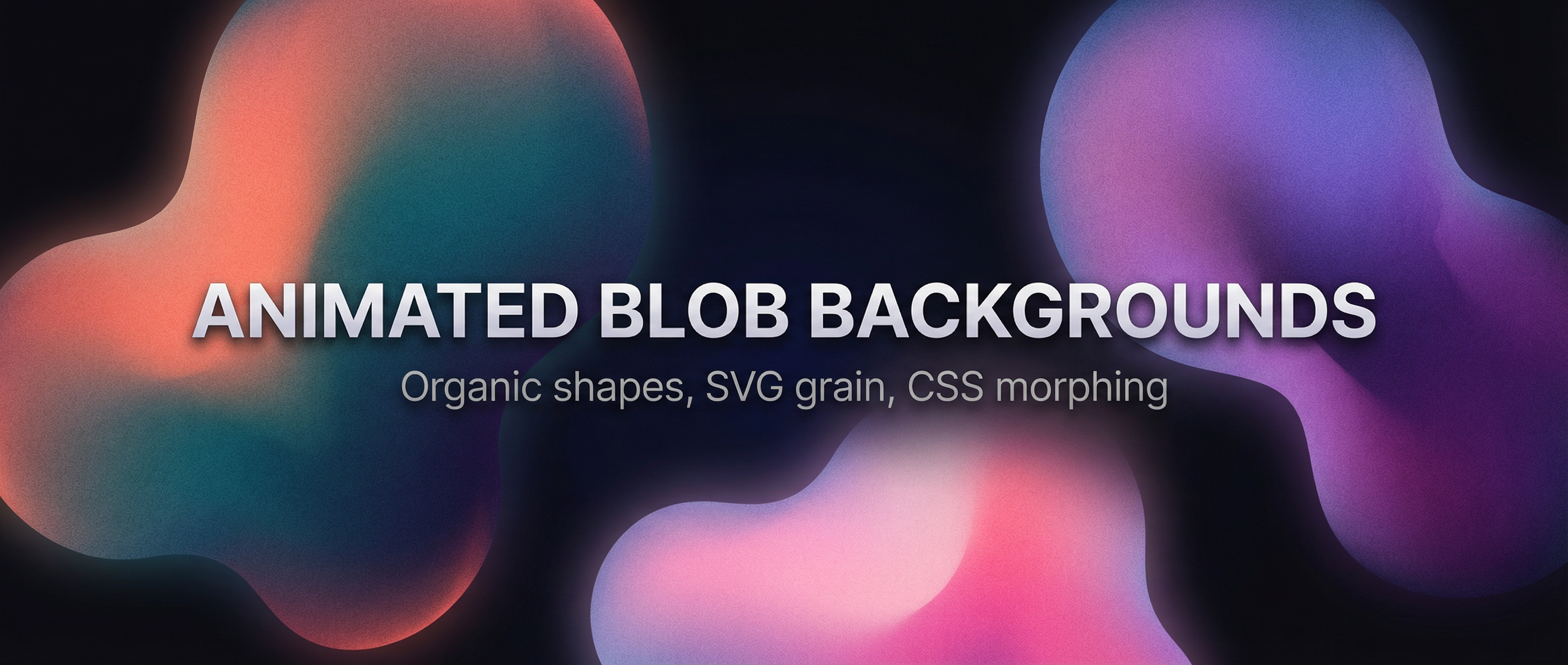
Create organic, animated blob backgrounds with smooth morphing shapes and grainy gradient fills. This snippet uses SVG filters (e.g. feTurbulence for grain) and CSS animations to morph blob shapes. Includes multiple color schemes and configurable animation speeds.
Overview
- Organic blob shapes — Smooth morphing via animated
border-radiusor SVG path interpolation. - Grainy gradient fills — SVG
feTurbulence(fractalNoise) combined with gradients for texture. - Multiple color schemes — e.g. coral/teal, purple/blue, warm sunset; switch via CSS variables or classes.
- Animation speeds — Slow, medium, and fast variants using different
animation-durationvalues. - Modern & minimal — Fits hero sections, landing pages, or UI backgrounds.
HTML Structure
Use a wrapper for the background and one or more blob elements. The grain overlay is an inline SVG filter referenced by the blobs or a full-bleed overlay.
<div class="blob-bg">
  <!-- Optional: SVG filter for grain (defined once, reused) -->
  <svg class="svg-filters" aria-hidden="true">
    <defs>
      <filter id="grain">
        <feTurbulence type="fractalNoise" baseFrequency="0.8" numOctaves="4" result="noise" />
        <feColorMatrix in="noise" type="saturate" values="0" result="mono" />
      </filter>
    </defs>
  </svg>

  <div class="blob blob--scheme-coral speed-slow"></div>
  <div class="blob blob--scheme-violet speed-medium"></div>
  <div class="blob blob--scheme-sunset speed-fast"></div>
</div>
CSS: Blob morphing and gradients
Blobs use large border-radius values (percentages) that animate to create morphing. Each corner gets a different value so the shape stays organic.
.blob-bg {
  position: relative;
  min-height: 100vh;
  overflow: hidden;
}

.blob {
  position: absolute;
  width: 60vmax;
  height: 60vmax;
  border-radius: 60% 40% 30% 70% / 60% 30% 70% 40%;
  filter: url(#grain);
  opacity: 0.85;
  mix-blend-mode: multiply;
}

/* Morph animation */
@keyframes morph {
  0%   { border-radius: 60% 40% 30% 70% / 60% 30% 70% 40%; }
  25%  { border-radius: 30% 60% 70% 40% / 50% 60% 30% 60%; }
  50%  { border-radius: 50% 60% 30% 60% / 30% 60% 70% 40%; }
  75%  { border-radius: 60% 40% 60% 30% / 70% 30% 50% 60%; }
  100% { border-radius: 60% 40% 30% 70% / 60% 30% 70% 40%; }
}

.blob {
  animation: morph 12s ease-in-out infinite;
}

.speed-slow  { animation-duration: 18s; }
.speed-medium { animation-duration: 12s; }
.speed-fast  { animation-duration: 8s; }
Color schemes
Define schemes with CSS variables and apply gradients to each blob.
.blob--scheme-coral {
  background: radial-gradient(circle at 30% 70%, #ff6b6b, #4ecdc4);
  top: -20%; left: -10%;
}

.blob--scheme-violet {
  background: radial-gradient(circle at 70% 30%, #667eea, #764ba2);
  top: 20%; right: -15%;
}

.blob--scheme-sunset {
  background: radial-gradient(circle at 50% 50%, #f093fb, #f5576c);
  bottom: -20%; left: 20%;
}
Grain with SVG filter
The #grain filter uses feTurbulence to add noise. You can composite it over the blob by applying filter: url(#grain) on the blob and tuning opacity, or use a separate full-screen div with the filter and blend mode so the blobs stay crisp and the grain sits on top.
Resources
- Demo: use the Demo button to see multiple schemes and speeds.
- Download: use the Download button to get the full source (HTML, CSS, and optional SVG) for the animated blob backgrounds.
Tips
- Adjust
baseFrequencyandnumOctavesinfeTurbulencefor finer or coarser grain. - Use
mix-blend-mode: multiplyoroverlayso blobs blend nicely with dark or light backgrounds. - For more dramatic motion, add a second keyframe set that shifts
transform: translate()slightly.