AI Interface Animations — Gemini, ChatGPT, Claude, Perplexity & Cursor
A minimal collection of ultra-smooth AI UI animations: Claude cogitating starburst, Gemini aurora text and video loaders, ChatGPT first-draft lattice, Perplexity image matrix, and Cursor planning next move.
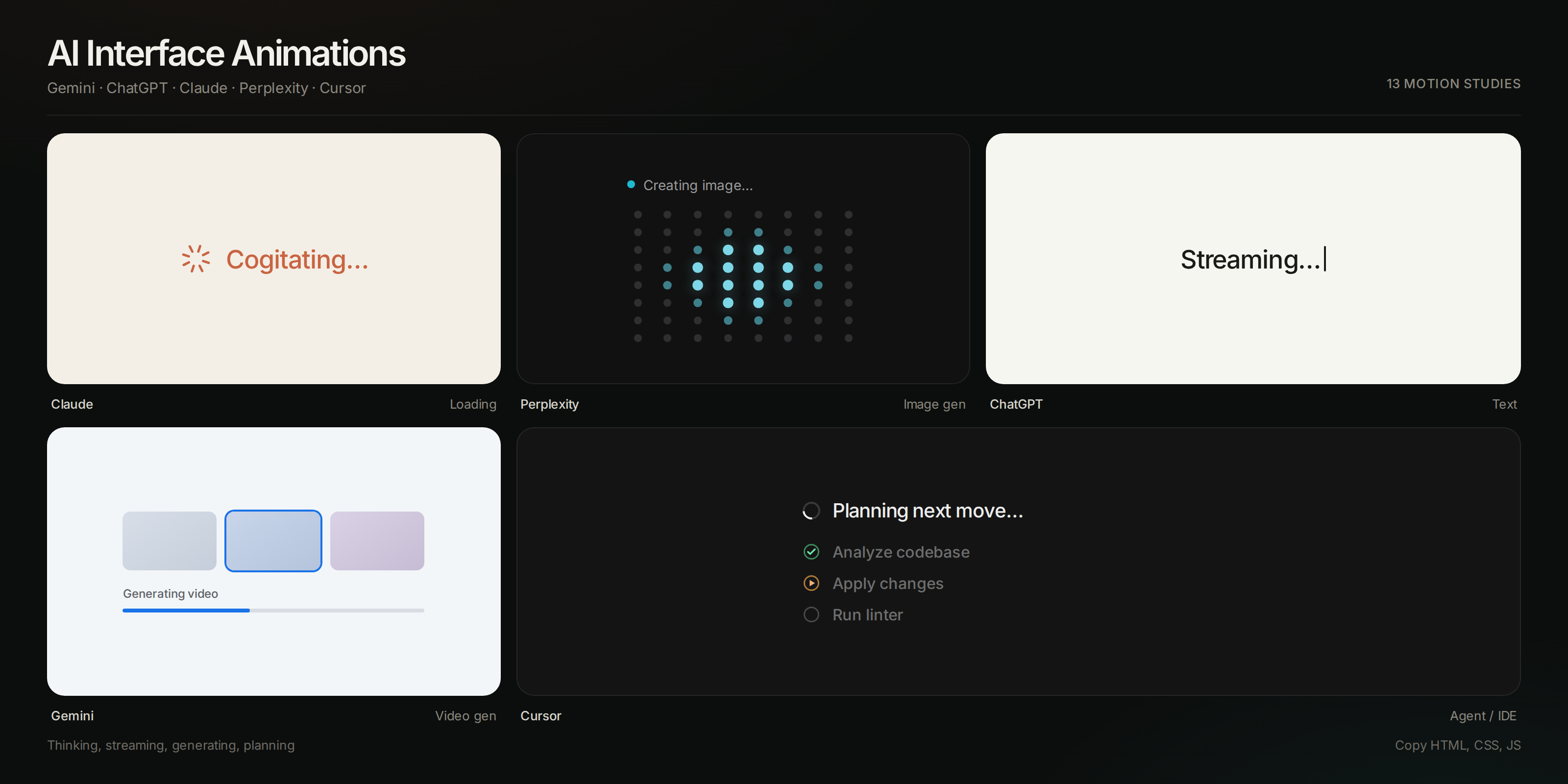
A quiet gallery of the motion language used by Gemini, ChatGPT, Claude, Perplexity, and Cursor. Each snippet is a self-contained thinking, streaming, or generating state — rebuilt from scratch in CSS (and a little JavaScript) with GPU-friendly transforms only.
The preview is searchable by product, category, and keyword. Each card has HTML, CSS, and (when needed) JS buttons — open a snippet, then copy it.
Open the live preview to browse, filter, and copy every variation.
What’s included
Thinking & loading
- Claude Cogitating Starburst — slow terracotta asterisk beside “Cogitating…”
- Gemini Thinking Sparkle — four-point star with the Gemini gradient
- ChatGPT Thinking Dots — three dots in a soft message pill
- Perplexity Search Orbit — rotating color ring around “Searching…”
Streaming text
- Gemini Aurora Text — a color wash moving through generating copy
- ChatGPT Streaming Caret — token typewriter with a blinking insertion caret
- Claude Word Reveal — words arriving one at a time with a short fade
Image generation
- Perplexity Image Matrix — 10×10 dot grid with a radial wave, “Creating image…”
- ChatGPT First Draft — black lavender lattice, two moving blooms, “Making the first draft” + percent pill
- ChatGPT Image Shimmer — rounded canvas with a diagonal scan
- Gemini Image Atmosphere — slow color fields filling a frame
Video generation
- Gemini Video Storyboard — three frames, a scan on the active shot, and a thin progress bar
IDE / agent
- Cursor Planning Next Move — arc spinner, shimmering status, and a live step list
- Cursor Ghost Completion — faded inline suggestion with a Tab hint
Motion notes
Animations use transform and opacity only, long easings, and no per-frame box-shadows on dense grids (the Perplexity matrix would otherwise drop frames). Continuous spins stay linear; everything else uses a sine-like curve.
Claude cogitating (starter)
<div class="claude-think">
  <svg class="claude-star" viewBox="0 0 24 24" fill="none">
    <g stroke="currentColor" stroke-width="1.75" stroke-linecap="round">
      <line x1="12" y1="2.5" x2="12" y2="6.5" />
      <line x1="12" y1="17.5" x2="12" y2="21.5" />
      <line x1="2.5" y1="12" x2="6.5" y2="12" />
      <line x1="17.5" y1="12" x2="21.5" y2="12" />
      <line x1="5.05" y1="5.05" x2="7.88" y2="7.88" />
      <line x1="16.12" y1="16.12" x2="18.95" y2="18.95" />
      <line x1="5.05" y1="18.95" x2="7.88" y2="16.12" />
      <line x1="16.12" y1="7.88" x2="18.95" y2="5.05" />
    </g>
  </svg>
  <span>Cogitating…</span>
</div>
.claude-think { display: flex; align-items: center; gap: 10px; color: #c96442; }
.claude-star { width: 22px; height: 22px; animation: spin 10s linear infinite; }
.claude-think span { animation: breathe 2.6s ease-in-out infinite; }
@keyframes spin { to { transform: rotate(360deg); } }
@keyframes breathe { 50% { opacity: 0.45; } }These motion details are the kind of reference that disappears into a bookmarks bar. Sachvu keeps prompts, repos, and saved pages as cards you can search by what you remember — a Claude cogitating state, a Gemini loader, a Cursor planning beat.