Designing Custom Textboxes and Input Elements from Scratch
Comprehensive design guide: Designing texteboxes and input element design from scratch using CSS.
Designing Stylish Text Boxes Using CSS: A Step-by-Step Tutorial
In this tutorial, we will creating captivating text box designs entirely from scratch. The process might seem intricate, but we’ll break it down into easily digestible steps, ensuring you achieve a stunning result.
Getting Started
Let’s begin with the fundamental syntax for crafting a text box in HTML:
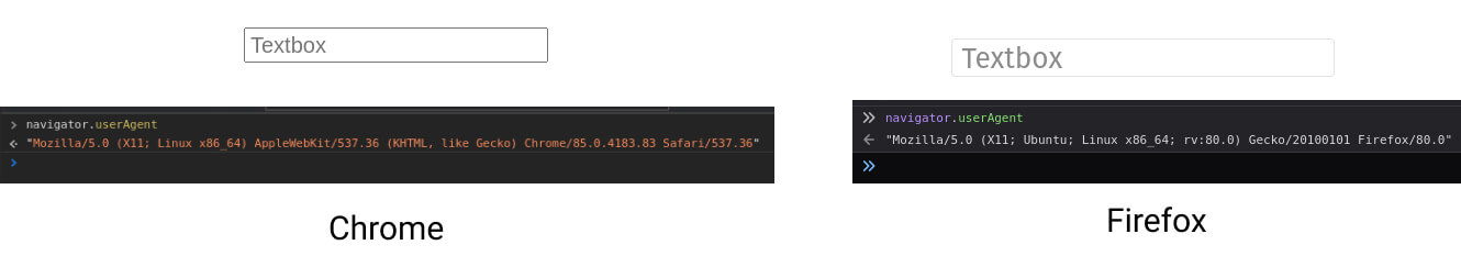
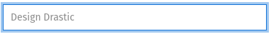
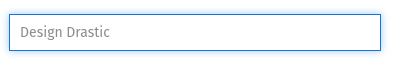
<input type="text" placeholder="Textbox" />It’s important to note that the appearance of this text box varies across different operating systems and browsers, giving it a distinctive look and feel.
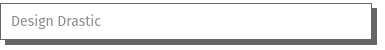
For instance, consider the default text box as displayed in Chrome (left side) and Firefox (right side):
Creating a Consistent Design
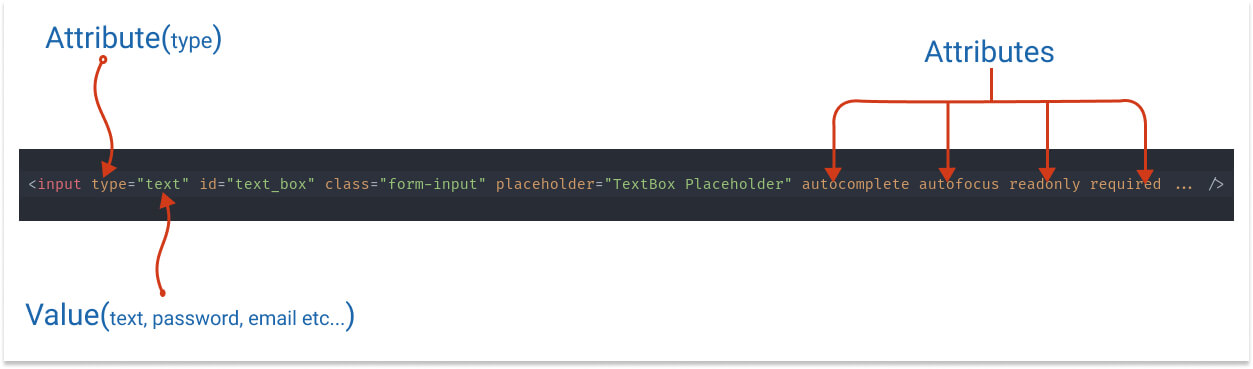
To achieve a uniform text box design, we will systematically implement CSS styling from the ground up. Here’s the basic HTML structure for the input text field:
We’ll progressively enhance this with CSS styling. Let’s begin with the foundation:
→ Basic CSS Class
.form-control {
  position: relative;
  display: inline-block;
  width: 100%;
  height: 30px;
  border: 1px solid #ccc;
  outline: none;
}
Step-by-Step Styling
1. Sizes
Tailoring the size of the text box is dependable. You have a range of options:
- width: 100%; – Expands to fill its parent component’s width.
- width: 50vw; – Occupies 50% of the viewport width.
- width: 400px; – Fixed width of 400 pixels.
- width: 10rem; – Relative to the font size of the parent element.
For height:
- height: 40px; or height: 2rem; – Set height explicitly.
- padding: 10px 0; or padding: 1rem 0; – Control height through padding.
2. Fonts
Font selection significantly impacts the text box’s user interface. Customize it with:
font-family: 'Open Sans', sans-seif;  /* or select the theme font or system font */
font-family: var(--theme-font);
font-family: -apple-system, BlinkMacSystemFont, 'Segoe UI', Roboto, Oxygen, Ubuntu, Cantarell, 'Open Sans', 'Helvetica Neue', sans-serif;`
Font sizes:
font-size: 1rem;
/* or */
font-size: 5vw;
/* or */
font-size: 16px;
→ Backgrounds
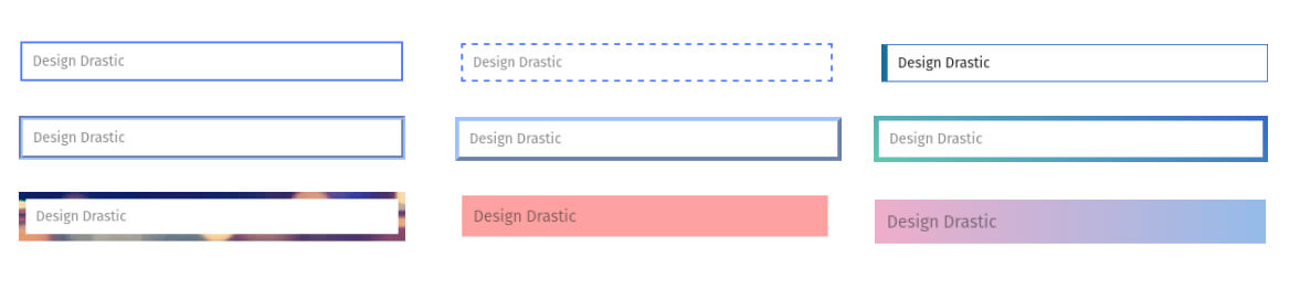
Experiment with different options:
background: #ccc; /* or */
background: var(--bg);
background-color: #e6e6e6 (light gray bg)
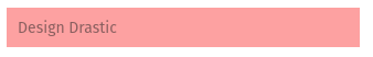
background-color: #FDA1A1
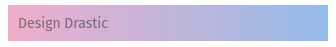
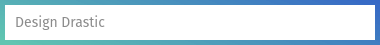
background-color: linear-gradient(
  90deg,
  rgb(238, 174, 202) 0%,
  rgb(148, 187, 233) 100%
);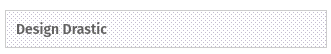
background-image: url("data:image/svg+xml,%3Csvg xmlns='http://www.w3.org/2000/svg' width='4' height='4' viewBox='0 0 4 4'%3E%3Cpath fill='%236b588b' fill-opacity='0.4' d='M1 3h1v1H1V3zm2-2h1v1H3V1z'%3E%3C/path%3E%3C/svg%3E");Backgrounds
Experiment with different options:
- background-color: #e6e6e6;
- background-color: #FDA1A1;
- background: linear-gradient(90deg, rgb(238, 174, 202), rgb(148, 187, 233));
- background-image: url(“data:image/svg+xml,…”);
→ Borders
Borders provide structure and visual appeal. Explore various styles:
- Solid, dashed, dotted, double, groove, outset, and custom border styles.
- border-bottom: 2px solid #3973bd;
- border-left: 5px solid #1a6e97;
- border-image: linear-gradient(20deg, #62c8b0, #3566c6) 5;
Border radius:
- border-radius: 5px;
- border-radius: 50px;
- border-radius: 50% / 25%;
- border-radius: 59% 41% 70% 30% / 37% 42% 58% 63%;
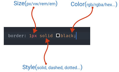
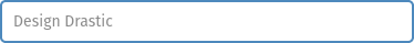
Border styles
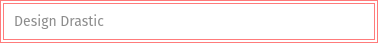
- Simple Gray border
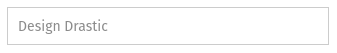
border: 1px solid #ccc
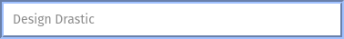
- Solid Blue border
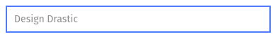
border-style: solid; border-color: var(--color);
- Dashed border
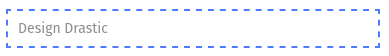
border-style: dashed;
- Dotted border
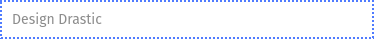
border-style: dotted;
- Double border
border-style: double;
- Groove border
border-style: groove;
- Outset border
border-style: outset;
- Border Bottom
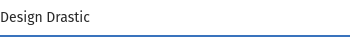
border: none; border-bottom: 2px solid #3973bd
- Border-left

border-left: 5px solid #1a6e97
- Border Image
Set border background image: Either using gradient CSS or background-image property.
border-width: 5px;
border-image: linear-gradient(20deg, #62c8b0, #3566c6) 5;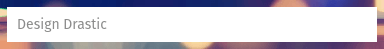
border-image: url(https://picsum.photos/640/360) 7;
Border Radius:
border-radius: 5px;

border-radius: 50px;
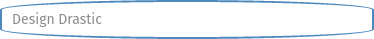
border-radius: 50% / 25%;

border-radius: 59% 41% 70% 30% / 37% 42% 58% 63%;
Reference: Fancy border raduis generator
→ Shadows
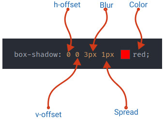
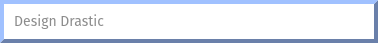
box-shadow: 0 0 0 3px #1575d966; border-color: #1575d9;
box-shadow: 5px 5px 0px 0px #666; border-color: #666;
box-shadow: 0 0 7px #1575d966; border-color: #1575d9;

box-shadow: 0 0 5px 0 rgba(0, 0, 0, 0.2) inset;
border-color: #90c0f2;
Pseudo Classes
Apply transformations upon interaction:
Pseudo Classes
Syntax:
.form-input:hover { --- css properties --- }:hover
You can combine any of the effects, for example, apply a shadow, opacity, change the border, animate the borders, etc…
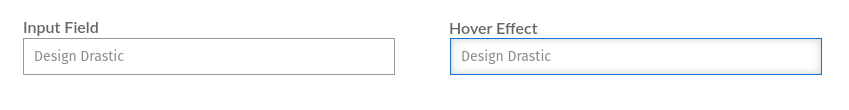
.form-input:hover {
  border-color: #1575d9;
  box-shadow: 0 0 8px #ccc inset;
}
:focus
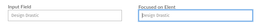
.form-input:focus {
border-color: #1575d9;
box-shadow: 0 0 0 3px #1575d966;
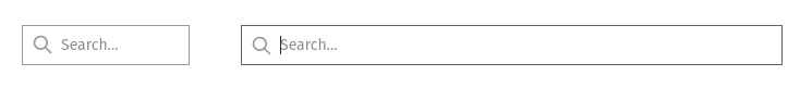
}→ Set the Image/Icon inside the Text Field
Using the background-image property you can set the Icon/Image inside the text fields.
bagkroudn-image: url("/path-to-you-ico");
padding-left: 40px;
→ Transition and Animations:
The transition/animation can be done either using CSS(Pseudo class) or using the Javascript.
In the below example, we will increase the width of the input field on focus.
.form-input {
  width: 150px;
  transition: all 0.5s linear;
}
.form-input:focus {
  width: 100%;
}
In the above example, the default width of the text box is 150px. Then we apply the transition/animation on focus.
To make smooth animation between the state we’ve added a .5s transition time.
For a live demonstration of these effects, check out our Input Text Box Effects snippet.
Happy designing!