Stunning Link Hover Effects with CSS
A set of captivative link hover effects and animation with pure css.
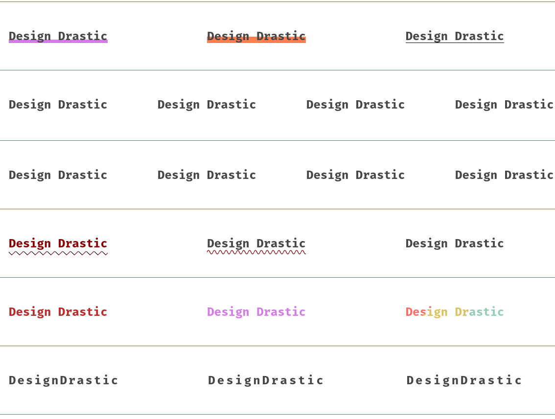
In this excerpt, we’ll unveil an array of link effects and thier respective hover animations, all achieved through the magic of CSS.
We will use pure CSS properties & SVG patterns to draft the snippet. We will use pseudo::after/::before selector, background gradient, SVG patterns & common CSS properties to achieve the effects.
You can modify the effects to fit your needs.
Let’s start with structuring the essential HTML for our links.
Html Code
<a href="#" class="dd-link shutter">Design Drastic</a>
<a href="#" class="dd-link shutter half">Design Drastic</a>
<a href="#" class="dd-link shutter black">Design Drastic</a>
<a href="#" class="dd-link slide left"
  ><span dd-text="Design Drastic">Design Drastic</span></a
>
<a href="#" class="dd-link slide right"
  ><span dd-text="Design Drastic">Design Drastic</span></a
>
<a href="#" class="dd-link slide top"
  ><span dd-text="Design Drastic">Design Drastic</span></a
>
<a href="#" class="dd-link slide bottom"
  ><span dd-text="Design Drastic">Design Drastic</span></a
>
<a href="#" class="dd-link layer left"
  ><span dd-text="Design Drastic">Design Drastic</span></a
>
<a href="#" class="dd-link layer right"
  ><span dd-text="Design Drastic">Design Drastic</span></a
>
<a href="#" class="dd-link layer top"
  ><span dd-text="Design Drastic">Design Drastic</span></a
>
<a href="#" class="dd-link layer bottom"
  ><span dd-text="Design Drastic">Design Drastic</span></a
>
<a href="#" class="dd-link patterns zigzag"
  ><span dd-text="Design Drastic">Design Drastic</span></a
>
<a href="#" class="dd-link patterns wave"
  ><span dd-text="Design Drastic">Design Drastic</span></a
>
<a href="#" class="dd-link patterns dots"
  ><span dd-text="Design Drastic">Design Drastic</span></a
>
<a href="#" class="dd-link gradient style1">Design Drastic</a>
<a href="#" class="dd-link gradient style2">Design Drastic</a>
<a href="#" class="dd-link gradient style3">Design Drastic</a>
<a href="#" class="dd-link block border"
  ><span>D</span><span>e</span><span>s</span><span>i</span><span>g</span
  ><span>n</span><span>D</span><span>r</span><span>a</span><span>s</span
  ><span>t</span><span>i</span><span>c</span></a
>
<a href="#" class="dd-link block char"
  ><span>D</span><span>e</span><span>s</span><span>i</span><span>g</span
  ><span>n</span><span>D</span><span>r</span><span>a</span><span>s</span
  ><span>t</span><span>i</span><span>c</span></a
>
<a href="#" class="dd-link block dot"
  ><span>D</span><span>e</span><span>s</span><span>i</span><span>g</span
  ><span>n</span><span>D</span><span>r</span><span>a</span><span>s</span
  ><span>t</span><span>i</span><span>c</span></a
>
CSS Style
:root {
  --pink: #d67ce9;
  --gray: #474747;
}
.a-link {
  position: relative;
  display: inline-block;
  font-family: "Fira Mono", sans-serif;
  text-decoration: none;
  font-size: 1.5rem;
  font-weight: 700;
  color: var(--gray);
  z-index: 1;
  transition: all 0.2s;
}
.a-link::after {
  position: absolute;
  content: "";
  bottom: 0;
  left: 0;
  right: 0;
  opacity: 1;
  transition: all 0.15s;
  z-index: -1;
} /* Shutter effect */
.a-link.shutter::after {
  height: 7px;
  background: var(--pink);
}
.a-link.shutter:hover::after {
  opacity: 0.75;
  height: 100%;
} /* shutter black */
.a-link.shutter.black::after {
  height: 1px;
  background: #000;
}
.a-link.shutter.black:hover {
  color: aliceblue;
}
.a-link.shutter.black:hover::after {
  transform: scale(1.1);
  height: 100%;
} /* Shutter half */
.a-link.shutter.half::after {
  height: 1px;
  background: coral;
}
.a-link.shutter.half:hover {
  color: black;
}
.a-link.shutter.half:hover::after {
  height: 50%;
} /* Slider */
.a-link.slide {
  overflow: hidden;
}
.a-link.slide span {
  display: inline-block;
  transition: all 0.5s;
}
.a-link.slide span::after {
  position: absolute;
  left: 0;
  content: attr(dd-text);
  color: var(--pink);
} /* top */
.a-link.slide.top span::after {
  transform: translateY(100%);
}
.a-link.slide.top:focus span,
.a-link.slide.top:hover span {
  transform: translateY(-100%);
} /* Bottom */
.a-link.slide.bottom span::after {
  transform: translateY(-100%);
}
.a-link.slide.bottom:focus span,
.a-link.slide.bottom:hover span {
  transform: translateY(100%);
} /* left */
.a-link.slide.left span::after {
  left: -100%;
  top: 50%;
  transform: translateY(-50%);
}
.a-link.slide.left:focus span,
.a-link.slide.left:hover span {
  transform: translateX(100%);
} /* Right */
.a-link.slide.right span::after {
  right: -100%;
  left: inherit;
  top: 50%;
  transform: translateY(-50%);
}
.a-link.slide.right:focus span,
.a-link.slide.right:hover span {
  transform: translateX(-100%);
} /* Box */
.a-link.box::after {
  background: var(--pink);
  transition: all 0.25s;
}
.a-link.box:hover {
  color: aliceblue;
}
.a-link.box:hover::after {
  transform: scaleY(1.2);
  width: 100%;
  height: 100%;
} /* left */
.a-link.box.left::after {
  width: 0;
  transform: scaleY(1.8);
  top: 0;
  right: 0;
  left: inherit;
}
.a-link.box.left:hover::after {
  transform: scaleY(1.2);
  width: 100%;
  left: 0;
  right: auto;
} /* right */
.a-link.box.right::after {
  width: 0;
  transform: scaleY(0.8);
  top: 0;
  left: 0;
  right: inherit;
}
.a-link.box.right:hover::after {
  width: 100%;
  transform: scaleY(1.2);
  left: auto;
  right: 0;
} /* top */
.a-link.box.top::after {
  height: 0;
  transform: scaleX(0.9);
  left: 0;
  top: inherit;
  bottom: 0;
}
.a-link.box.top:hover::after {
  height: 0;
  transform: scale(1.2);
  bottom: auto;
  top: 0;
  height: 100%;
} /* bottom */
.a-link.box.bottom::after {
  height: 0;
  transform: scaleX(1.3);
  left: 0;
  bottom: inherit;
  top: 0;
}
.a-link.box.bottom:hover::after {
  height: 0;
  transform: scale(1.2);
  top: auto;
  bottom: 0;
  height: 100%;
} /* Patterns - SVG */
.a-link.patterns:hover {
  color: darkred;
}
.a-link.patterns::after {
  content: "";
  bottom: -10px;
  width: 0;
  transition: 0.5s ease-in-out;
}
.a-link.patterns:hover::after {
  width: 100%;
} /* Zigzag */
.a-link.patterns.zigzag::after {
  height: 8px;
  background: url("data:image/svg+xml;base64,PHN2ZyB3aWR0aD0iMTUwIiBoZWlnaHQ9Ijc1IiB2aWV3Qm94PSIwIDAgMTUwIDc1IiBmaWxsPSJub25lIiB4bWxucz0iaHR0cDovL3d3dy53My5vcmcvMjAwMC9zdmciPgo8ZyBjbGlwLXBhdGg9InVybCgjY2xpcDApIj4KPHJlY3Qgd2lkdGg9IjE1MCIgaGVpZ2h0PSI3NSIgZmlsbD0id2hpdGUiPjwvcmVjdD4KPGxpbmUgeDE9Ii0xLjc2Nzc3IiB5MT0iNzMuMjMyMiIgeDI9IjczLjIzMjIiIHkyPSItMS43Njc3NyIgc3Ryb2tlPSJkYXJrcmVkIiBzdHJva2Utd2lkdGg9IjEwIj48L2xpbmU+CjxsaW5lIHgxPSI3Ni43Njc4IiB5MT0iLTEuNzY3NzciIHgyPSIxNTEuNzY4IiB5Mj0iNzMuMjMyMiIgc3Ryb2tlPSJibGFjayIgc3Ryb2tlLXdpZHRoPSIxMCI+PC9saW5lPgo8L2c+CjxkZWZzPgo8Y2xpcFBhdGggaWQ9ImNsaXAwIj4KPHJlY3Qgd2lkdGg9IjE1MCIgaGVpZ2h0PSI3NSIgZmlsbD0id2hpdGUiPjwvcmVjdD4KPC9jbGlwUGF0aD4KPC9kZWZzPgo8L3N2Zz4=");
  background-size: 16px auto;
}
.a-link.patterns.zigzag:hover::after {
  width: 100%;
  animation: animatePath 10s linear infinite;
  animation-delay: 0.75s;
} /* Wave */
.a-link.patterns.wave::after {
  height: 12px;
  background: url("data:image/svg+xml;base64,PHN2ZyB3aWR0aD0iMjAiIGhlaWdodD0iMjAiIHZpZXdCb3g9IjAgMCAxMTIgNzUiIGZpbGw9Im5vbmUiIHhtbG5zPSJodHRwOi8vd3d3LnczLm9yZy8yMDAwL3N2ZyI+CjxwYXRoIGQ9Ik0gMSwzNiBDIDkuMzMzMzMsOS42NjY2NiAzMS42LC0yNy43IDU2LDM1LjUgODAuNCw5OC43IDEwMi42NjcsNjIuMzMzMyAxMTEsMzYiIHN0cm9rZS13aWR0aD0iMTIiIHN0cm9rZT0iZGFya3JlZCI+PC9wYXRoPgo8L3N2Zz4=");
  background-size: 12px auto;
}
.a-link.patterns.wave:hover::after {
  width: 100%;
  animation: animatePath 10s linear infinite;
  animation-delay: 0.75s;
} /* Dots */
.a-link.patterns.dots::after {
  height: 20px;
  width: 0;
  background-size: 100% auto;
  bottom: -20px;
  background: url("data:image/svg+xml;base64,PHN2ZyB4bWxucz0iaHR0cDovL3d3dy53My5vcmcvMjAwMC9zdmciIHdpZHRoPSIxNSIgaGVpZ2h0PSIxNSI+CjxjaXJjbGUgY3g9IjMiIGN5PSI0LjMiIHI9IjEuNSIgZmlsbD0iIzhiMDAwMCI+PC9jaXJjbGU+Cjwvc3ZnPg==");
  background-size: 20px auto;
}
.a-link.patterns.dots:hover::after {
  width: 100%;
  animation: animatePath 10s linear infinite;
}
@keyframes animatePath {
  0% {
    background-position: 0 0;
  }
  100% {
    background-position: 100% 0;
  }
} /* Gradient */ /* Style 1 */
.a-link.gradient.style1 {
  background: linear-gradient(to right, #4d90fe 25%, #9d31db 50%, #bb2c2c 50%);
  background-clip: text;
  -webkit-background-clip: text;
  color: transparent;
  background-size: 200% auto;
  background-position: 100% 0;
  transition: all 0.75s;
} /* Style 2 */
.a-link.gradient.style2 {
  background: linear-gradient(
    145deg,
    #4d90fe 25%,
    #9d31db 25%,
    #9d31db 48%,
    var(--pink) 48%
  );
  background-size: 200% auto;
  background-position: 100% 0;
  background-clip: text;
  -webkit-background-clip: text;
  color: transparent;
  transition: all 0.75s;
} /* Style */
.a-link.gradient.style3 {
  background: linear-gradient(
    -45deg,
    #96ceb4 20%,
    #dcc261 20%,
    #dcc261 40%,
    #ff6f69 40%,
    #ff6f69 60%,
    #ffcc5c 60%,
    #ffcc5c 80%,
    #88d8b0 80%,
    #88d8b0 100%
  );
  background-clip: text;
  -webkit-background-clip: text;
  color: transparent;
  background-size: 200% 100%;
  background-position: 100% 0;
  transition: all 0.75s;
} /* Hover on gradient */
.a-link.gradient:hover {
  background-position: 0 0;
} /* Block Effects */
.a-link.block span {
  position: relative;
  padding-right: 3px;
}
.a-link.block span::after {
  position: absolute;
  content: "";
  bottom: -3px;
  background: var(--pink);
  transition: all 0.5s;
  z-index: -1;
} /* Border */
.a-link.block.border span::after {
  width: 0;
  height: 2px;
  left: 0;
}
.a-link.block.border:hover {
  color: var(--pink);
}
.a-link.block.border:hover span::after {
  width: 100%;
} /* Char */
.a-link.block.char span {
  padding: 2px;
}
.a-link.char span::after {
  width: 0;
  height: 100%;
  left: 0;
  background: var(--pink);
}
.a-link.char:hover {
  color: aliceblue;
}
.a-link.block.char:hover span::after {
  width: 100%;
} /* Dot */
.a-link.block.dot span {
  padding: 2px;
}
.a-link.block.dot span::after {
  width: 0;
  height: 0;
  border-radius: 5px;
  left: 50%;
  transform: translateX(-50%);
  height: 6px;
  transition: all 0.15s;
}
.a-link.dot:hover {
  color: var(--pink);
}
.a-link.dot:hover span::after {
  width: 4px;
  height: 4px;
}
Hope this will help you to emphasize the important links of your website. Feel free to weave your creativity into these effects to make them uniquely yours.
Feel free to share them with others!