Stunning Card Flip Effects and Animation with CSS
Create stunning card flip effects and 3d transition animation on hover using perspective & transformation CSS properties.
In this demo, we will share a stunning card flip animation with you. We will use CSS perspective & transformation properties to create the demo.
Card Design Overview
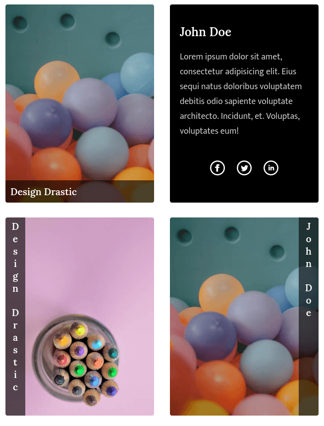
Before we dive into the any fuirther details, let’s take a quick look at the card design we’re going to create. The dimensions of our card will be set at 300 x 400 pixels(fixed), but feel free to adjust this size to suit your project’s requirements. Additionally, the card’s background will be determined using a data attribute, ‘dd-bg’, which we’ll set using jQuery:
<div class="front" dd-bg="/..path..to..image../"></div>HTML Structure
The HTML structure for our card involves a ‘dd-card’ container with a front and back side. Let’s break it down:
<div class="dd-card bottom">
  <div class="front" dd-bg="images/5.jpg">
    <label class="fornt-caption">Design Drastic</label>
  </div>
  <div class="back">
    <h2 class="dd-title">Design Drastic</h2>
    <p class="dd-text">
      Lorem ipsum dolor sit amet, consectetur adipisicing elit. Eius sequi natus
      doloribus voluptatem debitis odio sapiente voluptate architecto. Incidunt,
      et. Voluptas, voluptates eum!
    </p>
    <ul class="dd-card__link">
      <li>
        <a href="#"> <img src="svg/facebook.svg" /> </a>
      </li>
      <li>
        <a href="#"> <img src="svg/twitter.svg" /> </a>
      </li>
      <li>
        <a href="#"> <img src="svg/linkedin.svg" /> </a>
      </li>
    </ul>
  </div>
</div>
To achieve different card flip effects, you can modify the main class name of the ‘dd-card’ container. Here’s a list of classes for various effects:
— Bottom
<div class="dd-card bottom"></div>– Top
<div class="dd-card top"></div>— Vertical
<div class="dd-card vertical"></div>— Left
<div class="dd-card left"></div>—Right
<div class="dd-card right"></div>—Horizontal
<div class="dd-card horizontal"></div>CSS Styling
We’ve defined the structure, now let’s explore the CSS that brings the magic to this post. We’ll also provide a few style improvements for clarity:
CSS
:root {
  --ff-title: "Lora", serif;
  --ff-text: "Mukta", sans-serif;
}
.dd-title {
  font-family: var(--ff-title);
  color: #fff;
  font-weight: 600;
}
.dd-text {
  font-family: var(--ff-text);
  font-size: 1.1rem;
  color: #ffffffcc;
} /* Card */
.dd-card {
  position: relative;
  margin: 0 auto;
  margin-bottom: 100px;
  width: 300px;
  height: 400px;
}
.dd-card .front,
.dd-card .back {
  position: relative;
  transition: all 0.5s;
  width: 100%;
  height: 100%;
  overflow: hidden;
  border-radius: 4px;
  -webkit-backface-visibility: hidden;
  backface-visibility: hidden;
}
.dd-card .front {
  transform-origin: bottom;
  transform: perspective(600px) rotateX(0deg);
  top: 0;
  left: 0;
  background-size: cover !important;
  cursor: pointer;
}
.dd-card .fornt-caption {
  position: absolute;
  left: 0;
  width: 100%;
  background-color: rgba(0, 0, 0, 0.6);
  padding: 10px;
  color: #fff;
  font-weight: 500;
  font-family: var(--ff-title);
  font-size: 1.2rem;
  font-weight: 600;
}
.dd-card .back {
  position: absolute;
  top: 0;
  left: 0;
  padding: 20px;
  width: 100%;
  height: 100%;
  box-sizing: border-box;
  background-color: #000;
  color: #fff;
}
.dd-card__link {
  position: absolute;
  bottom: 20px;
  list-style: none;
  padding: 0;
  left: 0;
  width: 100%;
  text-align: center;
}
.dd-card__link li {
  display: inline-block;
  margin: 10px;
}
.dd-card__link li a img {
  width: 30px;
  transition: all 0.5s;
}
.dd-card__link li a:hover img {
  transform: scale(1.2);
} /* Bottom */
.dd-card.bottom .back {
  top: 100%;
  transform: perspective(600px) rotateX(-90deg);
  transform-origin: top;
}
.dd-card.bottom:hover .front {
  transform: perspective(600px) rotateX(90deg) translateY(0);
  top: -100%;
}
.dd-card.bottom .fornt-caption {
  bottom: 0;
} /* Top */
.dd-card.top .front {
  transform-origin: top;
}
.dd-card.top:hover .front {
  transform: perspective(0) rotateX(-90deg);
  top: 100%;
}
.dd-card.top .back {
  top: -100%;
  transform: perspective(600px) rotateX(90deg);
  transform-origin: bottom;
}
.dd-card:hover .back {
  top: 0;
  transform: perspective(0) rotateX(0deg);
}
.dd-card.top .fornt-caption {
  top: 0;
} /* Vertical */
.dd-card.vertical .front {
  transform-origin: center;
  -webkit-backface-visibility: hidden;
  backface-visibility: hidden;
}
.dd-card.vertical:hover .front {
  transform: rotateX(-180deg);
  left: 0;
}
.dd-card.vertical .back {
  -webkit-backface-visibility: hidden;
  backface-visibility: hidden;
  transform-origin: center;
  left: 0;
  transform: rotateX(180deg);
}
.dd-card.vertical:hover .back {
  left: 0;
  transform: rotateX(0deg);
} /* Left */
.dd-card.left .front {
  transform-origin: left;
}
.dd-card.left:hover .front {
  transform: perspective(600px) rotateY(90deg);
  left: 100%;
}
.dd-card.left .back {
  transform-origin: right;
  left: -100%;
  transform: perspective(600px) rotateY(-90deg);
}
.dd-card.left:hover .back {
  transform-origin: right;
  left: 0;
  transform: perspective(0) rotateY(0deg);
}
.dd-card.left .fornt-caption {
  left: 0;
  height: 100%;
  width: auto;
  writing-mode: vertical-rl;
  text-orientation: upright;
} /* Right */
.dd-card.right .front {
  transform-origin: right;
}
.dd-card.right:hover .front {
  transform: perspective(600px) rotateY(-90deg);
  left: -100%;
}
.dd-card.right .back {
  transform-origin: left;
  left: 100%;
  transform: perspective(600px) rotateY(90deg);
}
.dd-card.right:hover .back {
  transform-origin: left;
  left: 0;
  transform: perspective(0) rotateY(0deg);
}
.dd-card.right .fornt-caption {
  right: 0;
  left: auto;
  height: 100%;
  width: auto;
  writing-mode: vertical-rl;
  text-orientation: upright;
} /* Horizontal */
.dd-card.horizontal .front {
  transform-origin: center;
  -webkit-backface-visibility: hidden;
  backface-visibility: hidden;
}
.dd-card.horizontal:hover .front {
  transform: rotateY(-180deg);
  left: 0;
}
.dd-card.horizontal .back {
  -webkit-backface-visibility: hidden;
  backface-visibility: hidden;
  transform-origin: center;
  left: 0;
  transform: rotateY(180deg);
}
.dd-card.horizontal:hover .back {
  left: 0;
  transform: rotateY(0deg);
}
By making these enhancements, you’re now equipped to create stunning card flip animations with ease. Customize each element to match your project’s aesthetics and requirements.
Thanks for reading! Feeel free to share!!