Social Media Iocn Design and Hover Effects
Social media icon design and hover effects using CSS.
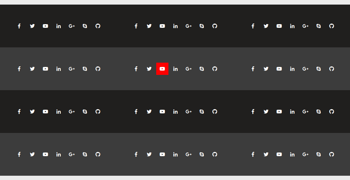
In this post, we’ll showcase a set of social media icons with creative hover animations. We’ve utilized Font Awesome icons for this demonstration and implemented these effects using basic CSS transitions and transformation properties.
Here’s the HTML structure for the social media icon list and its various hover animation effects:
HTML
<ul class="social-icon-list after-effect shutter-left">
  <li class="fb">
    <a href="#"><i class="fab fa-facebook-f"></i></a>
  </li>
  <li class="tw">
    <a href="#"><i class="fab fa-twitter"></i></a>
  </li>
  <li class="yt">
    <a href="#"><i class="fab fa-youtube"></i></a>
  </li>
  <li class="li">
    <a href="#"><i class="fab fa-linkedin-in"></i></a>
  </li>
  <li class="gp">
    <a href="#"><i class="fab fa-google-plus-g"></i></a>
  </li>
  <li class="sk">
    <a href="#"><i class="fab fa-skype"></i></a>
  </li>
  <li class="gh">
    <a href="#"><i class="fab fa-github"></i></a>
  </li>
</ul>
We’ll keep the above HTML structure common, and replace the prime class to update the effects. In the code snippet .shutter-left is a prime class.
The available prime classes are:
- ‘.shutter-right’
- ‘shutter-top’
- ‘shutter-bottom’
- ‘shutter-left-right’
- ‘shutter-right-left’
- ‘shutter-top-bottom’
- ‘shutter-bottom-top’
- ‘zoom out’
- ‘zoom in’
- ‘zoom rotate-out’
- ‘zoom rotate-in’
- ‘zoom in-out’
- ‘zoom out-in’
- ‘with-colors’
CSS
:root {
  --primary-color: #368ae9;
  --brand-fb: #3b5998;
  --brand-tw: #1da1f2;
  --brand-yt: #ff0000;
  --brand-li: #0077b5;
  --brand-gp: #dd4b39;
  --brand-sk: #00aff0;
  --brand-gh: #333;
}
.social-icon-list {
  position: relative;
  list-style: none;
  margin: 0;
  padding: 0;
}
.social-icon-list li {
  display: inline;
}
.social-icon-list li a {
  position: relative;
  display: inline-block;
  color: #fff;
  width: 40px;
  height: 40px;
  line-height: 40px;
  text-align: center;
  -webkit-transition: all 0.75s ease-out;
  -moz-transition: all 0.75s ease-out;
  -ms-transition: all 0.75s ease-out;
  -o-transition: all 0.75s ease-out;
  transition: all 0.75s ease-out;
}
.social-icon-list.with-colors li.fb a:hover {
  background: var(--brand-fb);
}
.social-icon-list.with-colors li.tw a:hover {
  background: var(--brand-tw);
}
.social-icon-list.with-colors li.yt a:hover {
  background: var(--brand-yt);
}
.social-icon-list.with-colors li.li a:hover {
  background: var(--brand-li);
}
.social-icon-list.with-colors li.gp a:hover {
  background: var(--brand-gp);
}
.social-icon-list.with-colors li.sk a:hover {
  background: var(--brand-sk);
}
.social-icon-list.with-colors li.gh a:hover {
  background: var(--brand-gh);
}
.social-icon-list.after-effect li a {
  z-index: 1;
}
.social-icon-list.after-effect li a:after {
  position: absolute;
  content: " ";
  z-index: -1;
  -webkit-transition: all 0.25s ease-out;
  -moz-transition: all 0.25s ease-out;
  -ms-transition: all 0.25s ease-out;
  -o-transition: all 0.25s ease-out;
  transition: all 0.25s ease-out;
}
.social-icon-list.after-effect li.fb a:after {
  background: var(--brand-fb);
}
.social-icon-list.after-effect li.tw a:after {
  background: var(--brand-tw);
}
.social-icon-list.after-effect li.yt a:after {
  background: var(--brand-yt);
}
.social-icon-list.after-effect li.li a:after {
  background: var(--brand-li);
}
.social-icon-list.after-effect li.gp a:after {
  background: var(--brand-gp);
}
.social-icon-list.after-effect li.sk a:after {
  background: var(--brand-sk);
}
.social-icon-list.after-effect li.gh a:after {
  background: var(--brand-gh);
}
.social-icon-list.shutter-left li a:after {
  top: 0;
  left: 0;
  height: 100%;
  width: 0;
}
.social-icon-list.shutter-left li a:hover:after {
  width: 100%;
}
.social-icon-list.shutter-right li a:after {
  top: 0;
  right: 0;
  height: 100%;
  width: 0;
}
.social-icon-list.shutter-right li a:hover:after {
  width: 100%;
}
.social-icon-list.shutter-top li a:after {
  top: 0;
  left: 0;
  width: 100%;
  height: 0;
}
.social-icon-list.shutter-top li a:hover:after {
  height: 100%;
}
.social-icon-list.shutter-bottom li a:after {
  bottom: 0;
  left: 0;
  width: 100%;
  height: 0;
}
.social-icon-list.shutter-bottom li a:hover:after {
  height: 100%;
}
.social-icon-list.shutter-left-right li a:after {
  top: 0;
  right: 0;
  height: 100%;
  width: 0;
}
.social-icon-list.shutter-left-right li a:hover:after {
  left: 0;
  right: auto;
  width: 100%;
}
.social-icon-list.shutter-right-left li a:after {
  top: 0;
  left: 0;
  height: 100%;
  width: 0;
}
.social-icon-list.shutter-right-left li a:hover:after {
  right: 0;
  left: auto;
  width: 100%;
}
.social-icon-list.shutter-top-bottom li a:after {
  bottom: 0;
  left: 0;
  width: 100%;
  height: 0;
}
.social-icon-list.shutter-top-bottom li a:hover:after {
  height: 100%;
  top: 0;
  bottom: auto;
}
.social-icon-list.shutter-bottom-top li a:after {
  top: 0;
  left: 0;
  width: 100%;
  height: 0;
}
.social-icon-list.shutter-bottom-top li a:hover:after {
  height: 100%;
  top: auto;
  bottom: 0;
}
.social-icon-list.zoom li a:after {
  top: 50%;
  left: 50%;
  -webkit-transform: translate(-50%, -50%);
  -moz-transform: translate(-50%, -50%);
  -ms-transform: translate(-50%, -50%);
  -o-transform: translate(-50%, -50%);
  transform: translate(-50%, -50%);
  margin: 0 auto;
  opacity: 0;
}
.social-icon-list.zoom.out li a:after {
  width: 75%;
  height: 75%;
}
.social-icon-list.zoom.in li a:after {
  width: 125%;
  height: 125%;
}
.social-icon-list.zoom li a:hover:after {
  width: 100%;
  height: 100%;
  opacity: 1;
}
.social-icon-list.zoom.rotate-out li a:after {
  top: 0;
  left: 0;
  -webkit-transform: scale(0.5) rotate(0deg);
  -moz-transform: scale(0.5) rotate(0deg);
  -ms-transform: scale(0.5) rotate(0deg);
  -o-transform: scale(0.5) rotate(0deg);
  transform: scale(0.5) rotate(0deg);
}
.social-icon-list.zoom.rotate-out li a:hover:after {
  -webkit-transform: scale(1) rotate(90deg);
  -moz-transform: scale(1) rotate(90deg);
  -ms-transform: scale(1) rotate(90deg);
  -o-transform: scale(1) rotate(90deg);
  transform: scale(1) rotate(90deg);
}
.social-icon-list.zoom.rotate-in li a:after {
  top: 0;
  left: 0;
  -webkit-transform: scale(1.5) rotate(0deg);
  -moz-transform: scale(1.5) rotate(0deg);
  -ms-transform: scale(1.5) rotate(0deg);
  -o-transform: scale(1.5) rotate(0deg);
  transform: scale(1.5) rotate(0deg);
}
.social-icon-list.zoom.rotate-in li a:hover:after {
  -webkit-transform: scale(1) rotate(90deg);
  -moz-transform: scale(1) rotate(90deg);
  -ms-transform: scale(1) rotate(90deg);
  -o-transform: scale(1) rotate(90deg);
  transform: scale(1) rotate(90deg);
}
.social-icon-list.zoom.out-in li a:after {
  top: 0;
  left: 0;
}
.social-icon-list.zoom.out-in li a:hover:after {
  -webkit-animation: zoomOutIn 1s ease;
  -moz-animation: zoomOutIn 1s ease;
  -ms-animation: zoomOutIn 1s ease;
  -o-animation: zoomOutIn 1s ease;
  animation: zoomOutIn 1s ease;
  animation-fill-mode: forwards;
}
@-webkit-keyframes zoomOutIn {
  0% {
    -webkit-transform: scale(0.75);
    -moz-transform: scale(0.75);
    -ms-transform: scale(0.75);
    -o-transform: scale(0.75);
    transform: scale(0.75);
  }
  40% {
    -webkit-transform: scale(1.25);
    -moz-transform: scale(1.25);
    -ms-transform: scale(1.25);
    -o-transform: scale(1.25);
    transform: scale(1.25);
  }
  100% {
    -webkit-transform: scale(1);
    -moz-transform: scale(1);
    -ms-transform: scale(1);
    -o-transform: scale(1);
    transform: scale(1);
  }
}
@keyframes zoomOutIn {
  0% {
    -webkit-transform: scale(0.75);
    -moz-transform: scale(0.75);
    -ms-transform: scale(0.75);
    -o-transform: scale(0.75);
    transform: scale(0.75);
  }
  40% {
    -webkit-transform: scale(1.25);
    -moz-transform: scale(1.25);
    -ms-transform: scale(1.25);
    -o-transform: scale(1.25);
    transform: scale(1.25);
  }
  100% {
    -webkit-transform: scale(1);
    -moz-transform: scale(1);
    -ms-transform: scale(1);
    -o-transform: scale(1);
    transform: scale(1);
  }
}
.social-icon-list.zoom.in-out li a:after {
  top: 0;
  left: 0;
}
.social-icon-list.zoom.in-out li a:hover:after {
  -webkit-animation: zoomInOut 1s ease;
  -moz-animation: zoomInOut 1s ease;
  -ms-animation: zoomInOut 1s ease;
  -o-animation: zoomInOut 1s ease;
  animation: zoomInOut 1s ease;
  animation-fill-mode: forwards;
}
@-webkit-keyframes zoomInOut {
  0% {
    -webkit-transform: scale(1.25);
    -moz-transform: scale(1.25);
    -ms-transform: scale(1.25);
    -o-transform: scale(1.25);
    transform: scale(1.25);
  }
  40% {
    -webkit-transform: scale(0.75);
    -moz-transform: scale(0.75);
    -ms-transform: scale(0.75);
    -o-transform: scale(0.75);
    transform: scale(0.75);
  }
  100% {
    -webkit-transform: scale(1);
    -moz-transform: scale(1);
    -ms-transform: scale(1);
    -o-transform: scale(1);
    transform: scale(1);
  }
}
@keyframes zoomInOut {
  0% {
    -webkit-transform: scale(1.25);
    -moz-transform: scale(1.25);
    -ms-transform: scale(1.25);
    -o-transform: scale(1.25);
    transform: scale(1.25);
  }
  40% {
    -webkit-transform: scale(0.75);
    -moz-transform: scale(0.75);
    -ms-transform: scale(0.75);
    -o-transform: scale(0.75);
    transform: scale(0.75);
  }
  100% {
    -webkit-transform: scale(1);
    -moz-transform: scale(1);
    -ms-transform: scale(1);
    -o-transform: scale(1);
    transform: scale(1);
  }
}
The HTML structure consists of multiple icon lists contained within different div containers, each with a specific background color. This creates a clear separation between variations of animations and their effects.
In the CSS section, we’ve defined the primary and brand colors using CSS variables, making it easy to update the color scheme across the entire design. Each animation effect is detailed within the code, with comments explaining the purpose of each section.
The “with-colors” class allows icons to change their background color on hover, matching the brand colors. This dynamic effect enhances the visual appeal of the icons.
We hope you find this demonstration informative! Feel free to use and adapt these examples for your projects.